Elevate the Essential
Client
Racket
scope
Brand
Identity
Web
sector
Retail
The Background
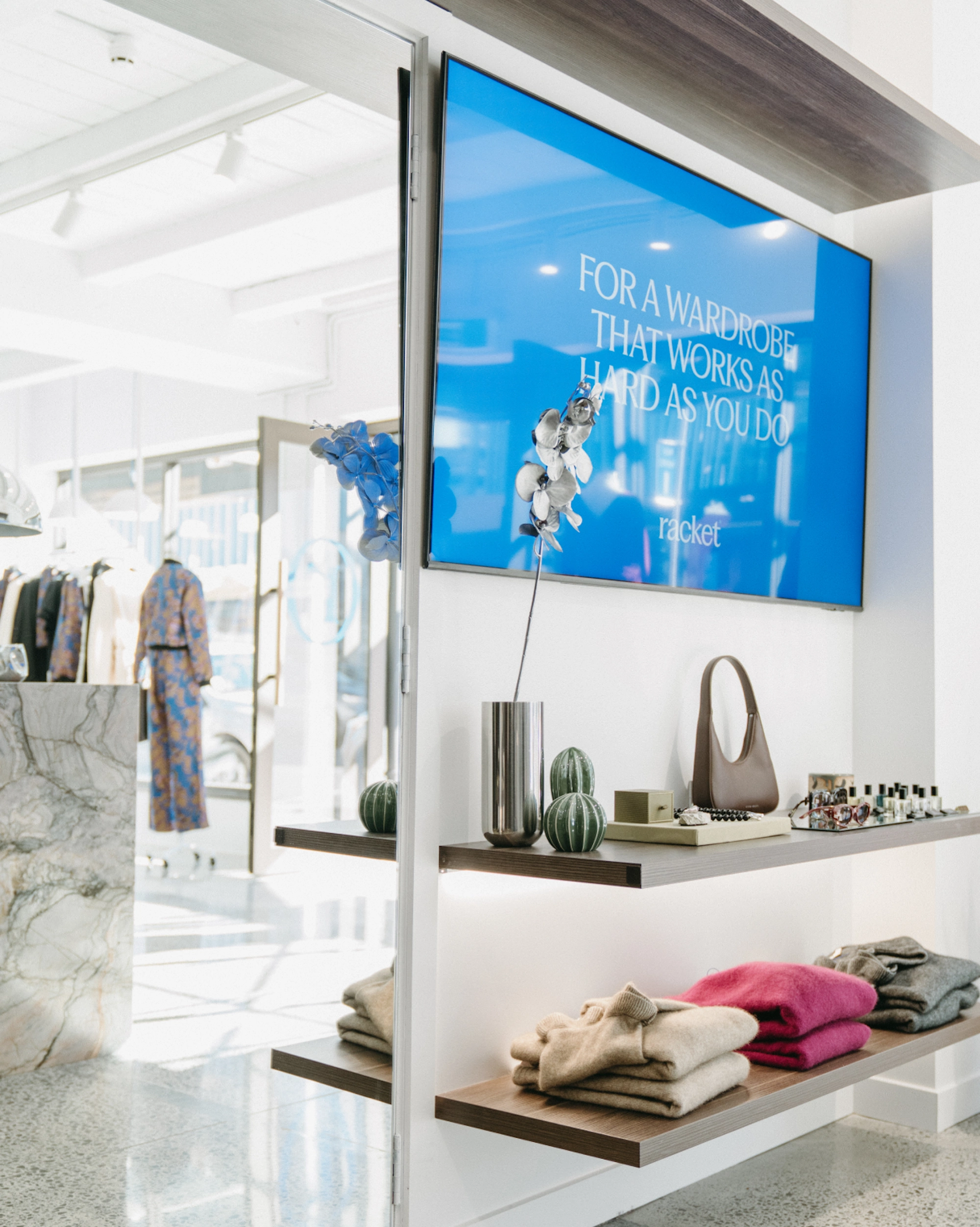
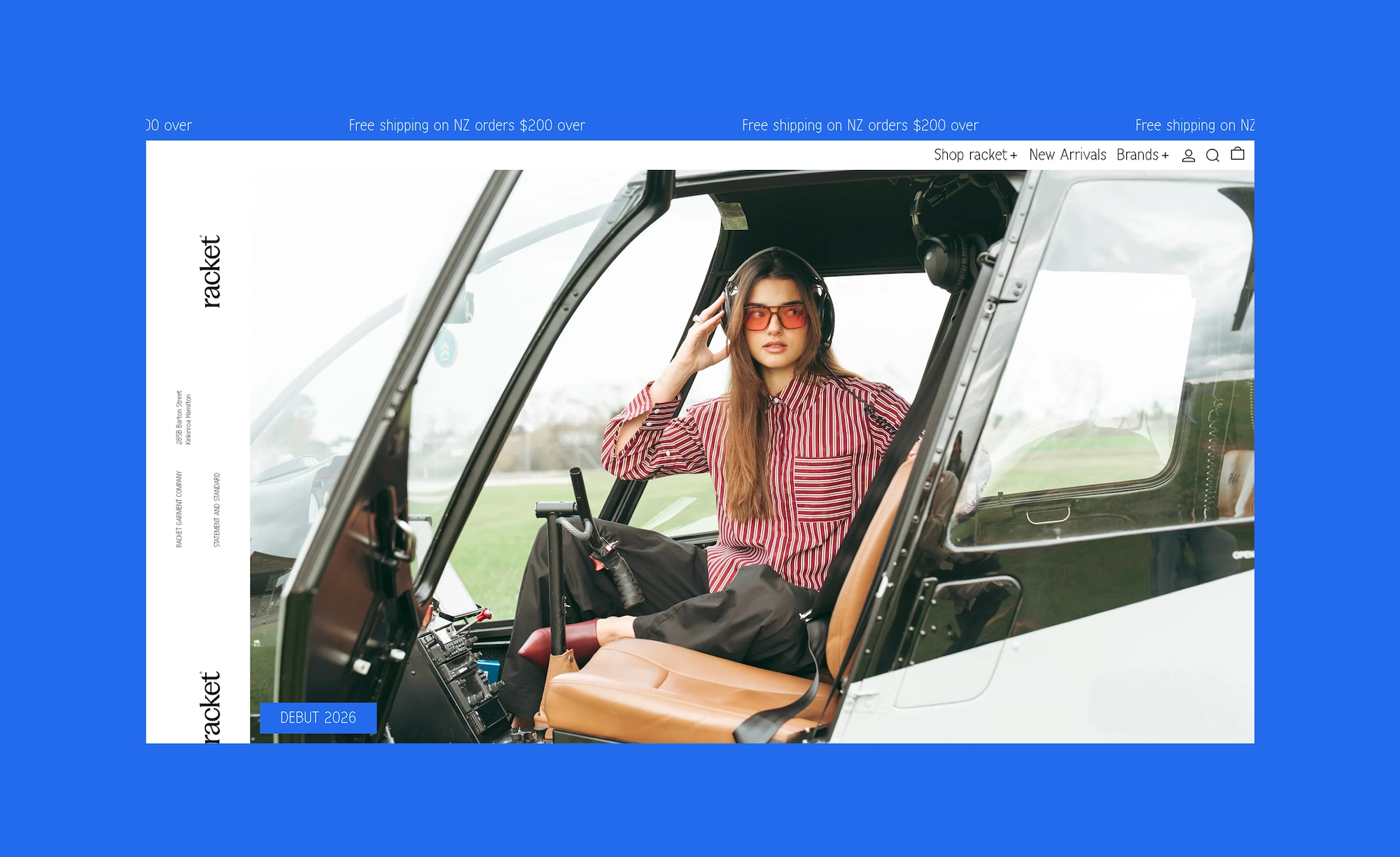
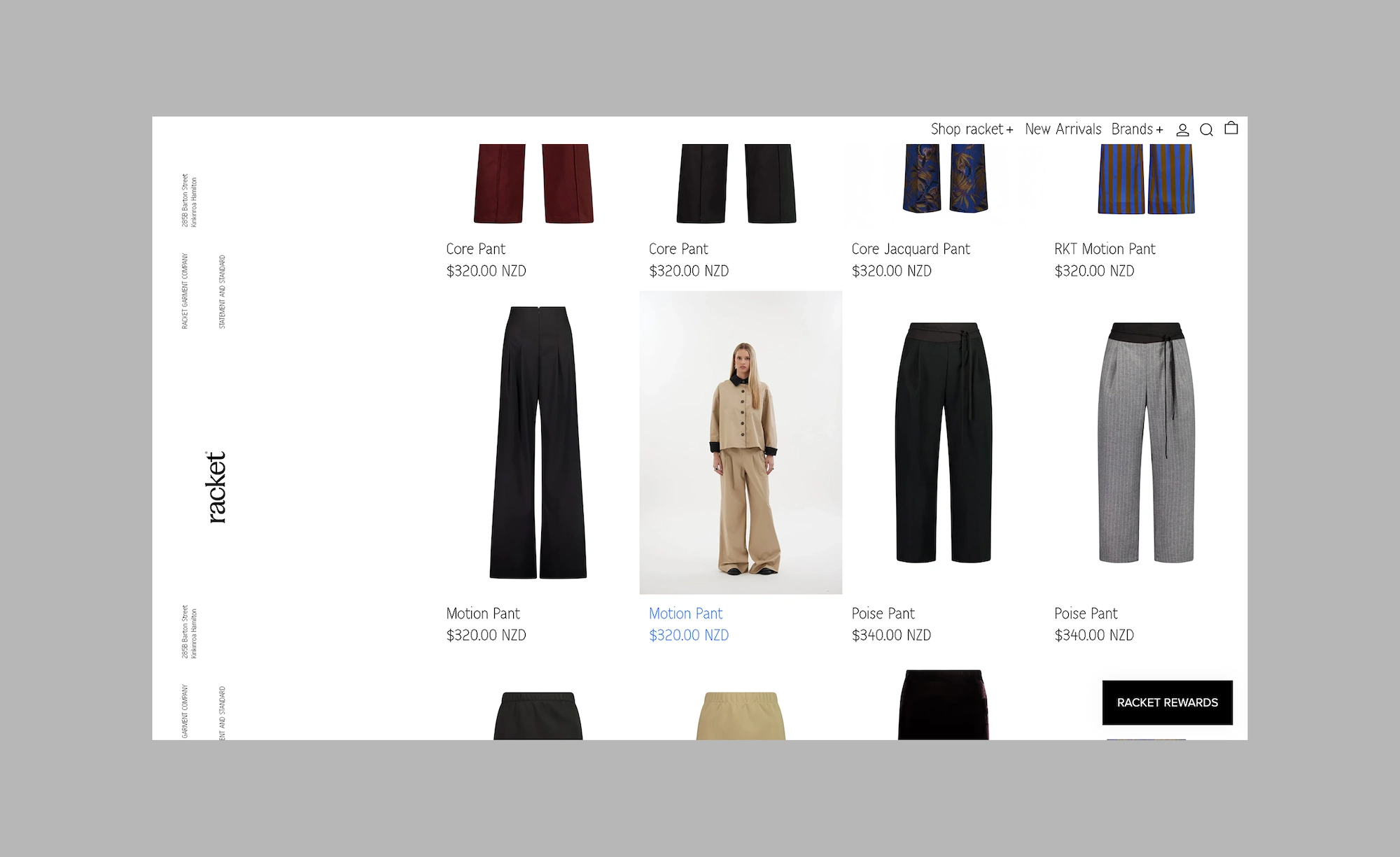
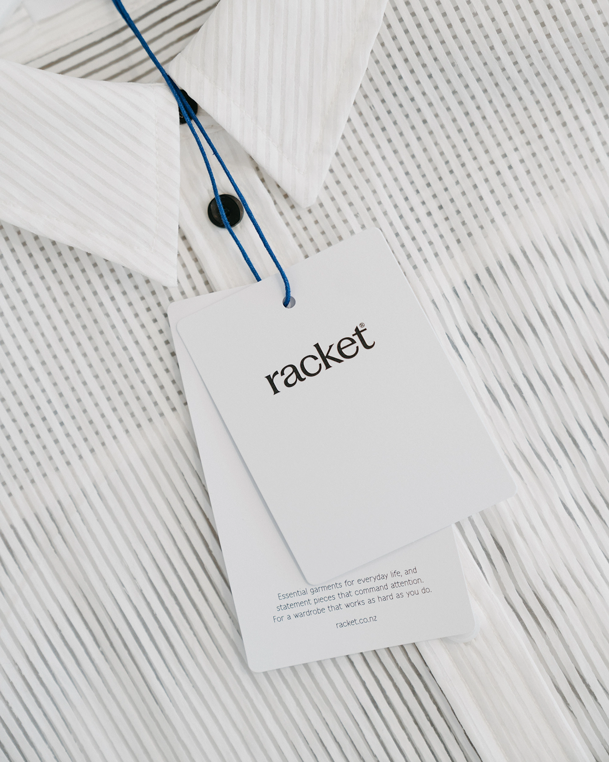
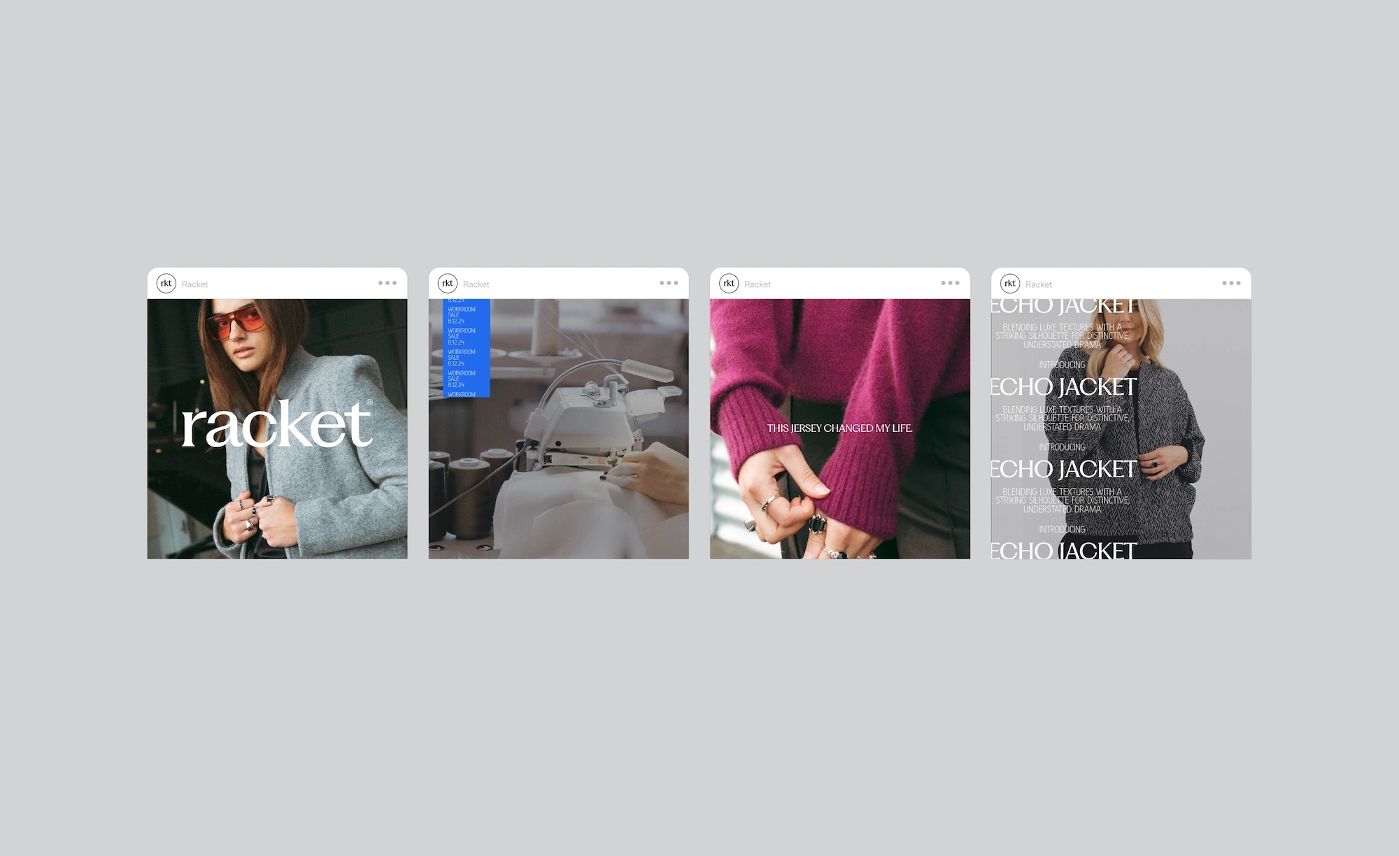
We partnered with Kate Harris to craft a brand identity for the launch of her new fashion label, Racket. A sharp strategy was required from day one - a standard that protects the vision and values as the business grows. She wanted the brand to reach tread-savvy women who work hard, balance well and refuse to compromise on style as they go. It also needed to smoothly repurpose the existing brand NES without alienating current customers.
The Solution
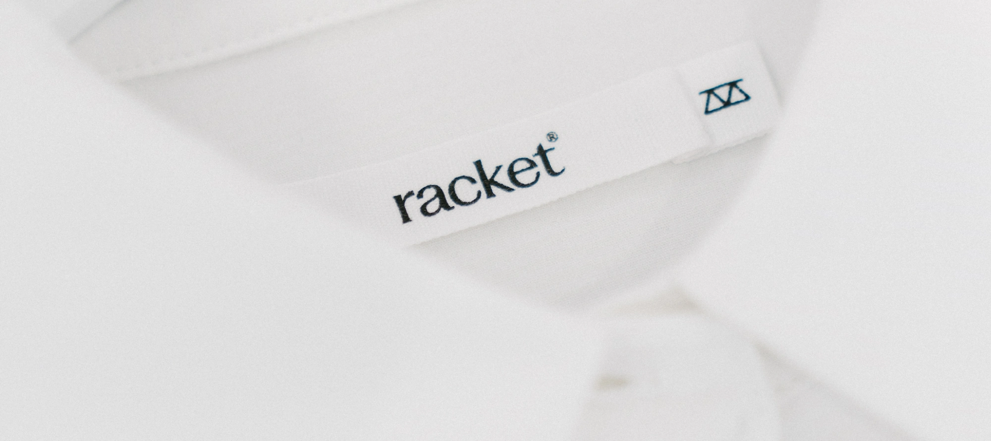
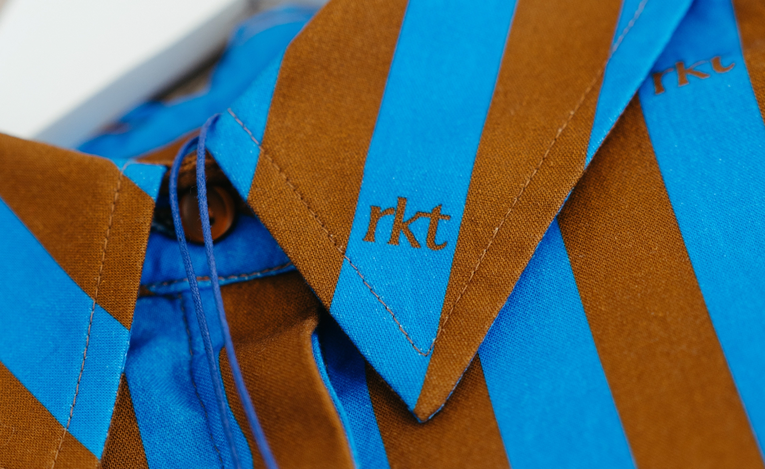
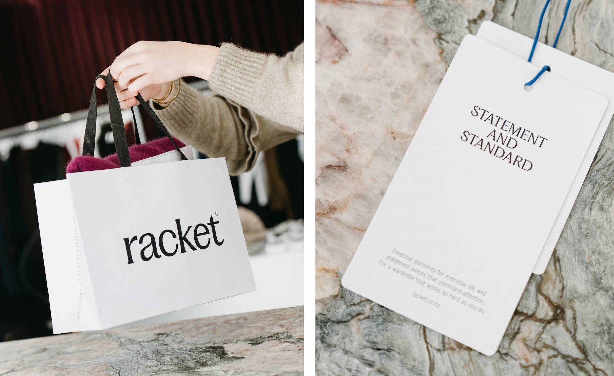
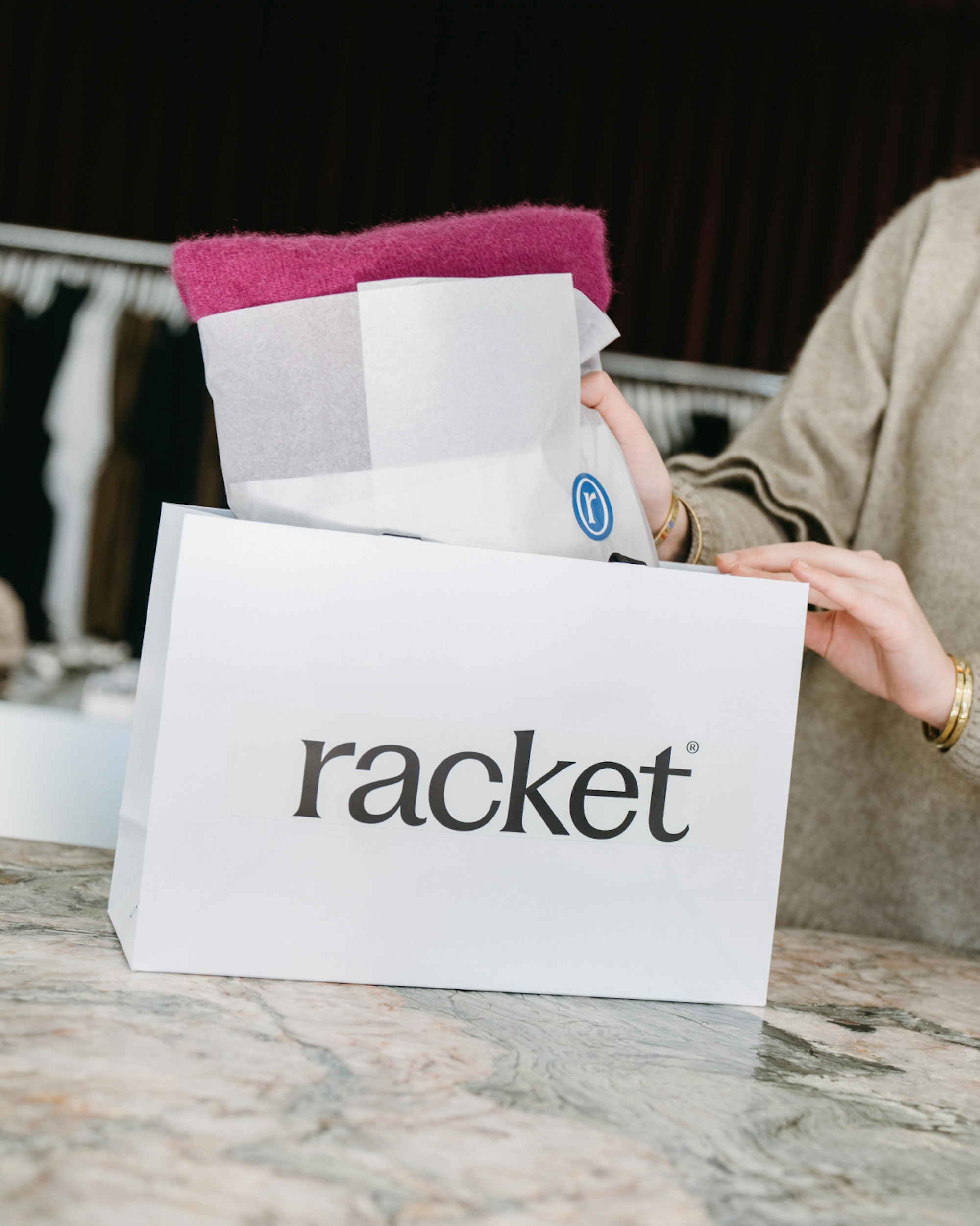
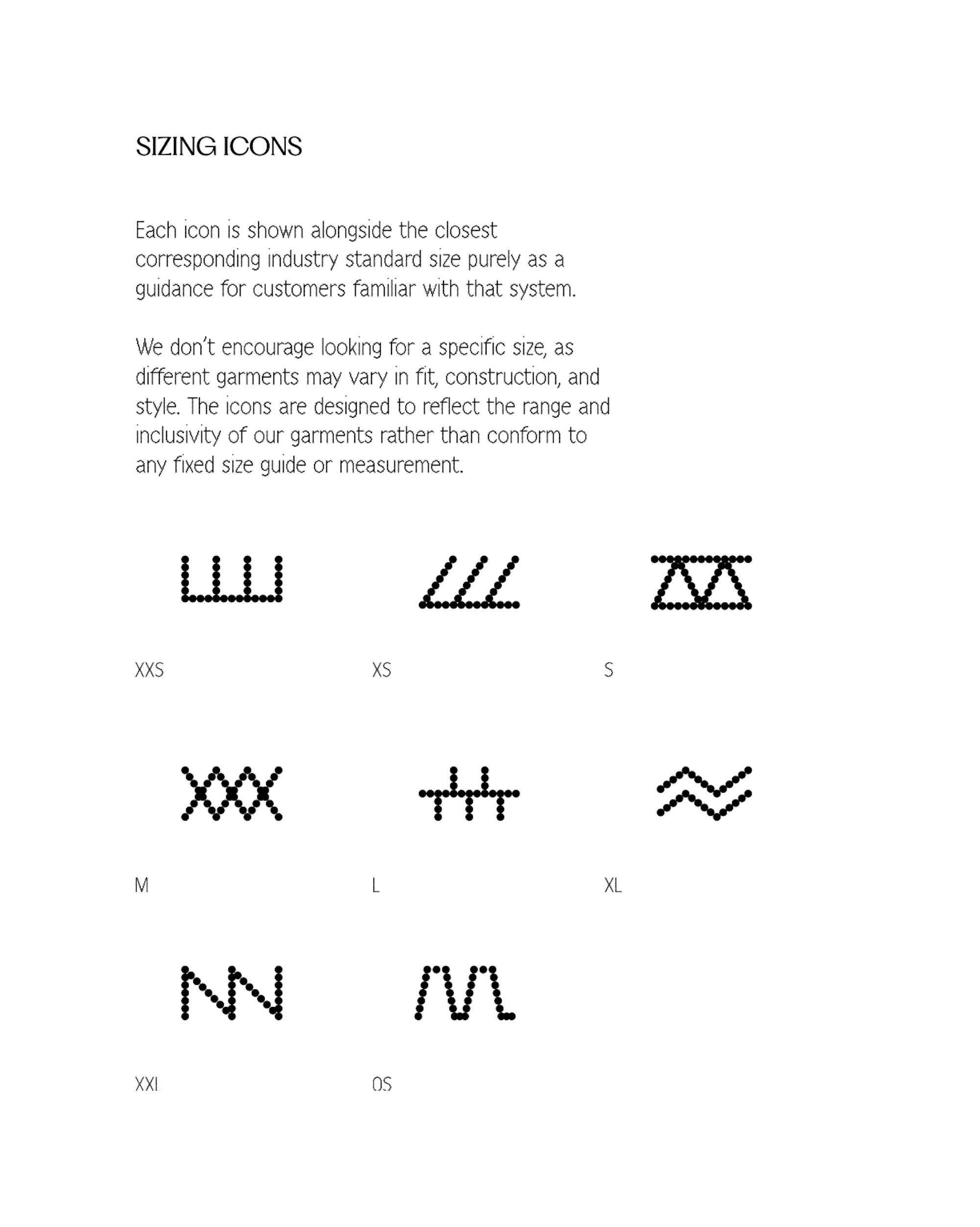
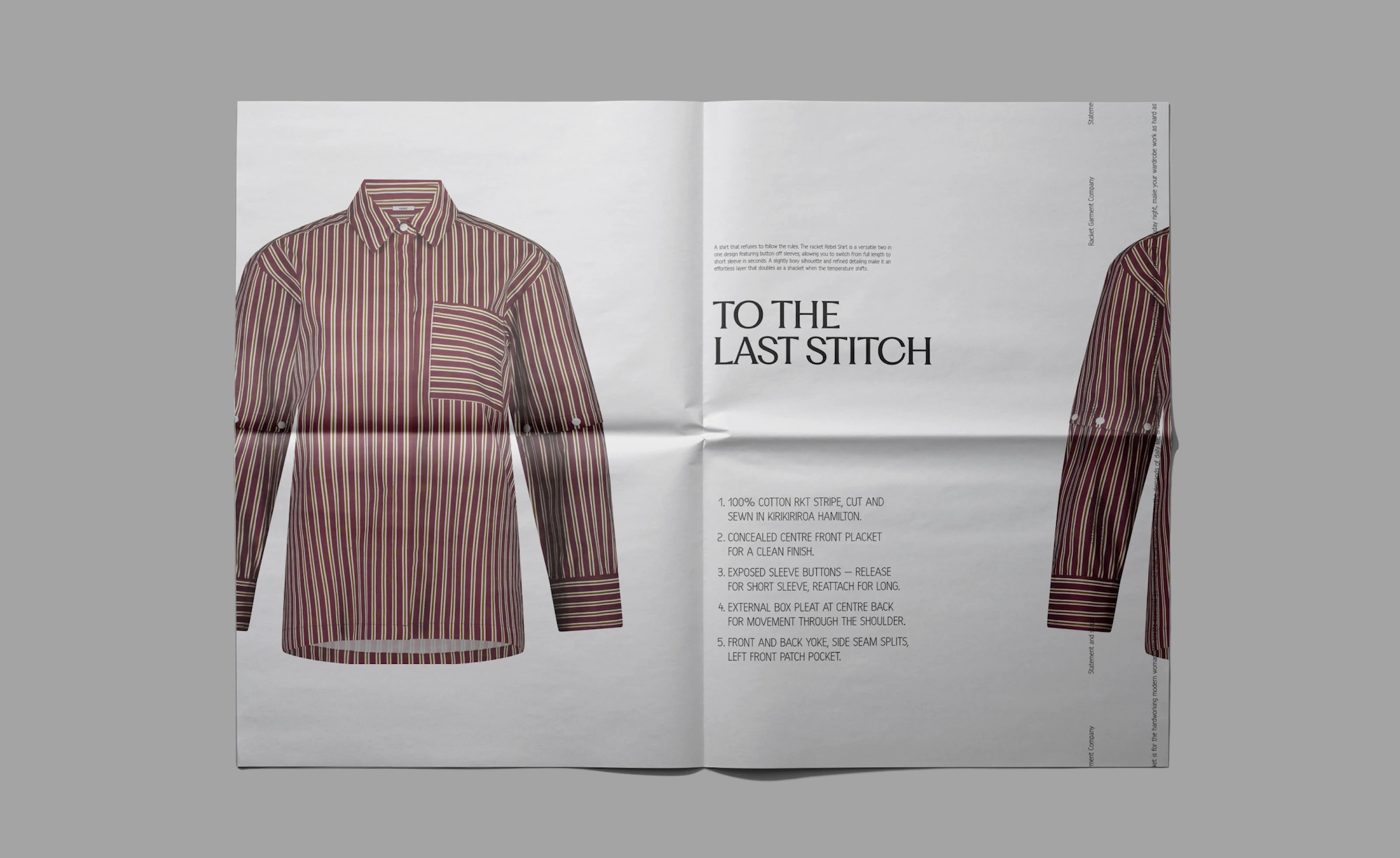
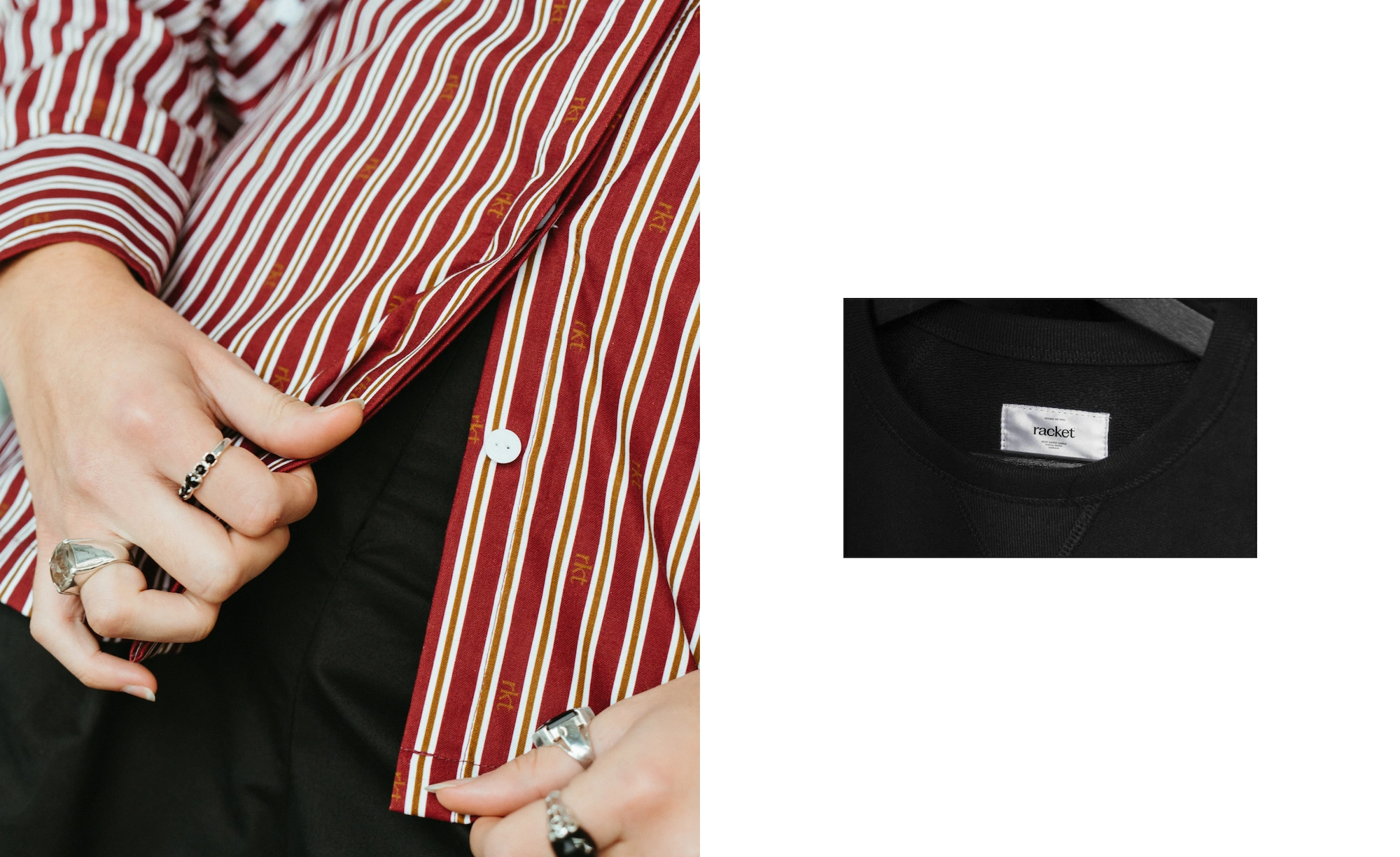
Our first priority was to translate Kate’s core vision - “making a racket” - into a confident, self-aware brand identity. We honed in on Racket’s key strengths in the market - local design and ethically sourced fabrics - which inspired many of the design details. The secondary typeface Harber mimics a stitch-like pattern which we used to give the brand an intentional, crafted feel. We also used Harber for the sizing pips - using icons rather than standard numbers to accommodate varying fits and construction style to style. These choices also reinforce the brand values - a label that’s interested in individual style over a mainstream wardrobe. To ensure a seamless transition for loyal customers, we reimagined the original NES brand as 'New Essential Staples' - reframing it as the ultimate basics line. It's a thoughtful refresh that allows Racket to take up space without losing the loyalty NES earned along the way.
The Outcome
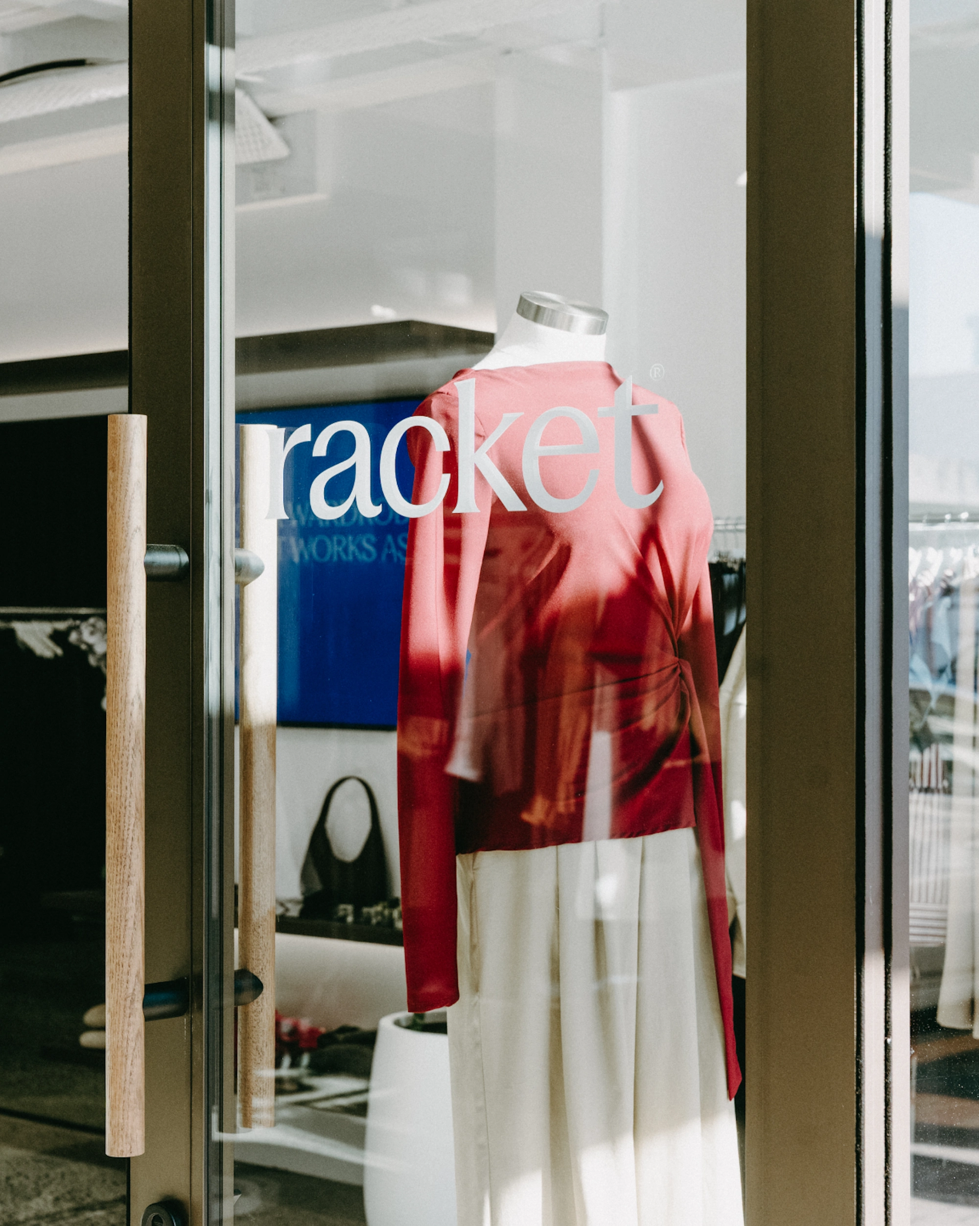
Racket debuted with a clear identity that resonated immediately with style-conscious women. By grounding the brand in local craft and ethical sourcing, Racket launched with instant credibility. Rebranding the original line as 'New Essential Staples' retained loyal customers while introducing the new direction. The strategy gave Racket a bold, distinct voice - setting the business up for long-term growth while honouring Kate’s vision to ‘make a racket’.
Credits
PP Fragment Glare by Pangram Pangram
Harber by bb-bureau

©MMXXII Daymark Studio Ltd, all rights reserved. Privacy Policy.
