See the bigger picture
Client
Misty Flicks
scope
All Projects
Identity
Motion
Strategy
Social Media
sector
Arts
The Background
Misty Flicks came to us with a bold ambition: evolve their film festival into the cultural heartbeat of Aotearoa’s independent film community. They needed a brand that could hold the weight of that vision — something confident, cinematic and unmistakably local. The existing identity lacked cohesion and didn’t capture the depth, energy, or aspiration behind their kaupapa. Misty Flicks needed a system that could flex across an ever-growing ecosystem of events — from screenings and Q&As to labs, workshops, podcasts and digital platforms — all while retaining a strong, ownable character.


The Strategy
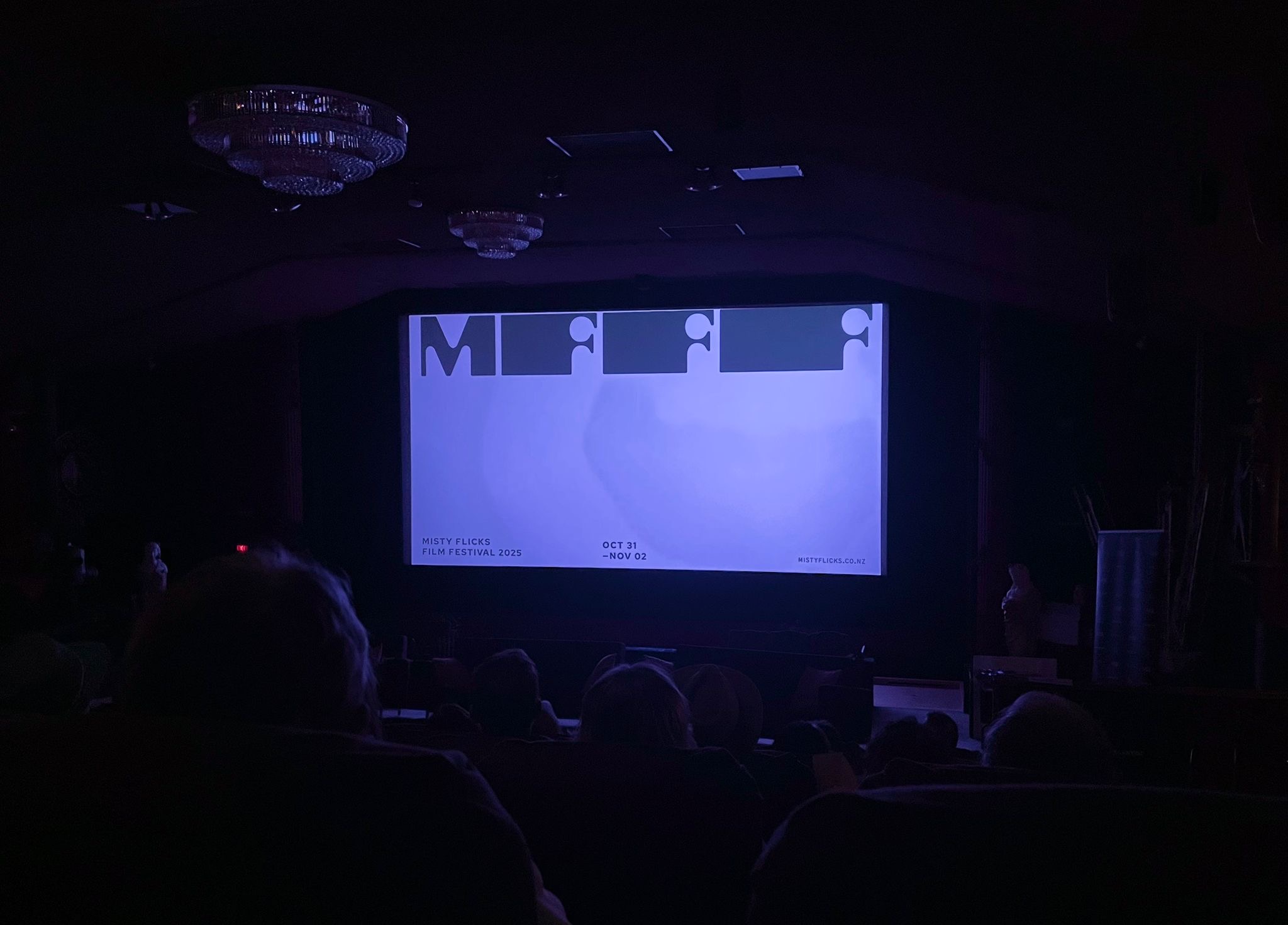
We began by uncovering the heart of the festival: “See the bigger picture” — a strategic idea that speaks to both the power of cinema and the uniquely Aotearoa stories Misty Flicks champions. From this, we developed a brand strategy anchored in authenticity, independence and a proudly local voice. With strategy established, we shaped a full identity system that mirrors the craft of filmmaking itself. We explored aspect ratios, gradients, typographic systems and motion principles, ensuring every component connected back to the cinematic experience. The goal was a brand that feels alive — shifting, stretching and framing stories in a way only Misty Flicks can.
The Solution
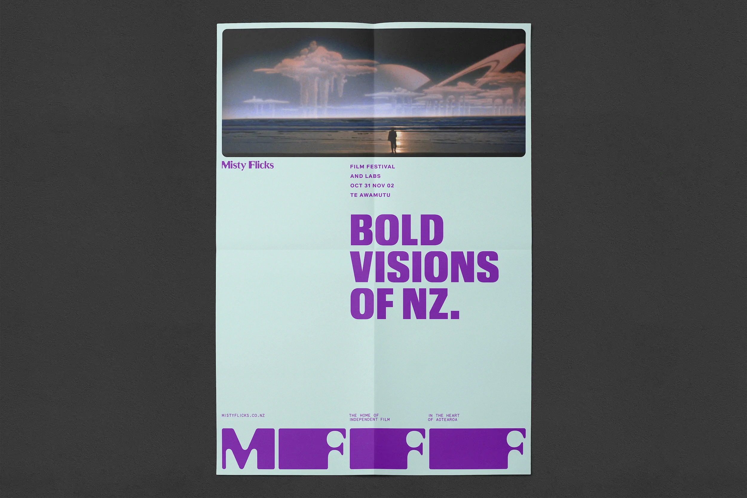
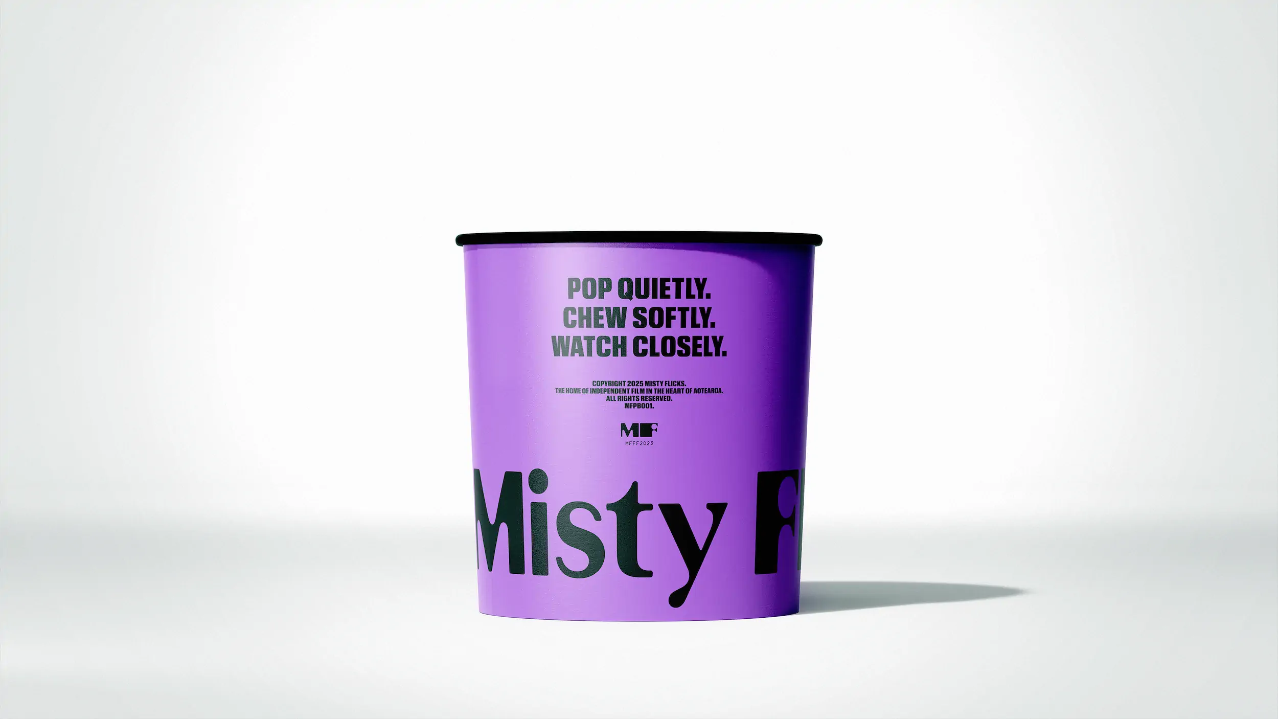
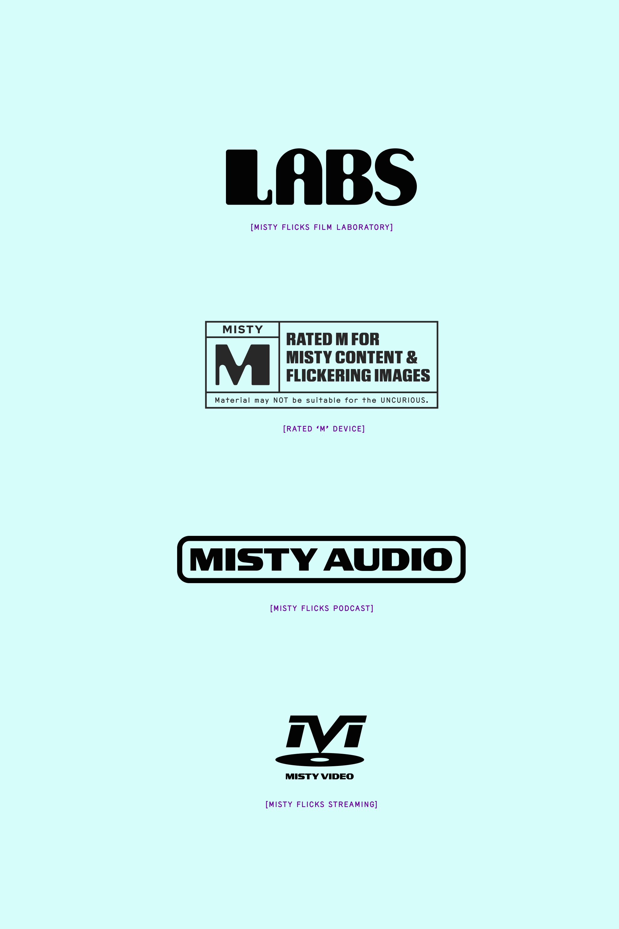
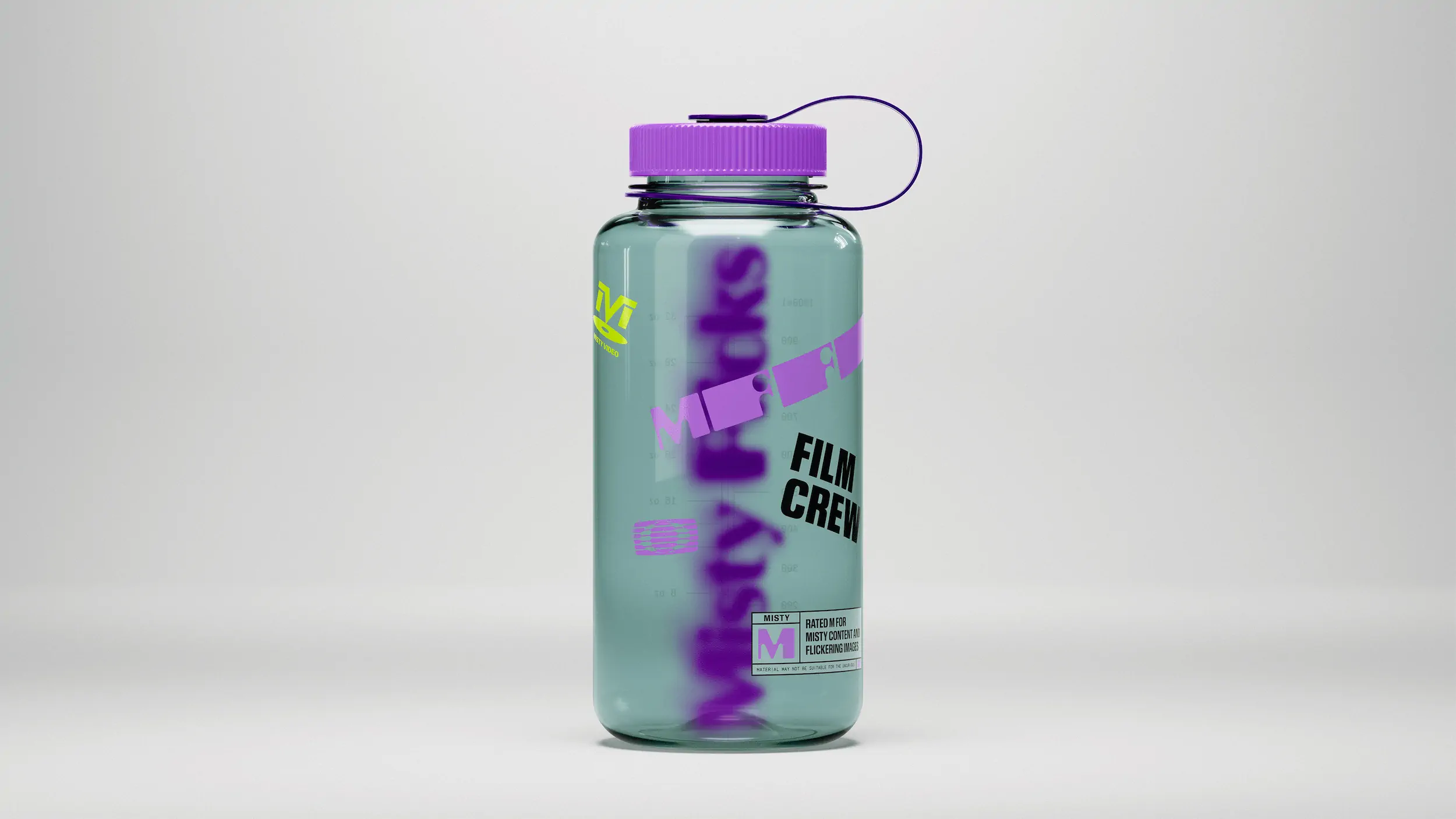
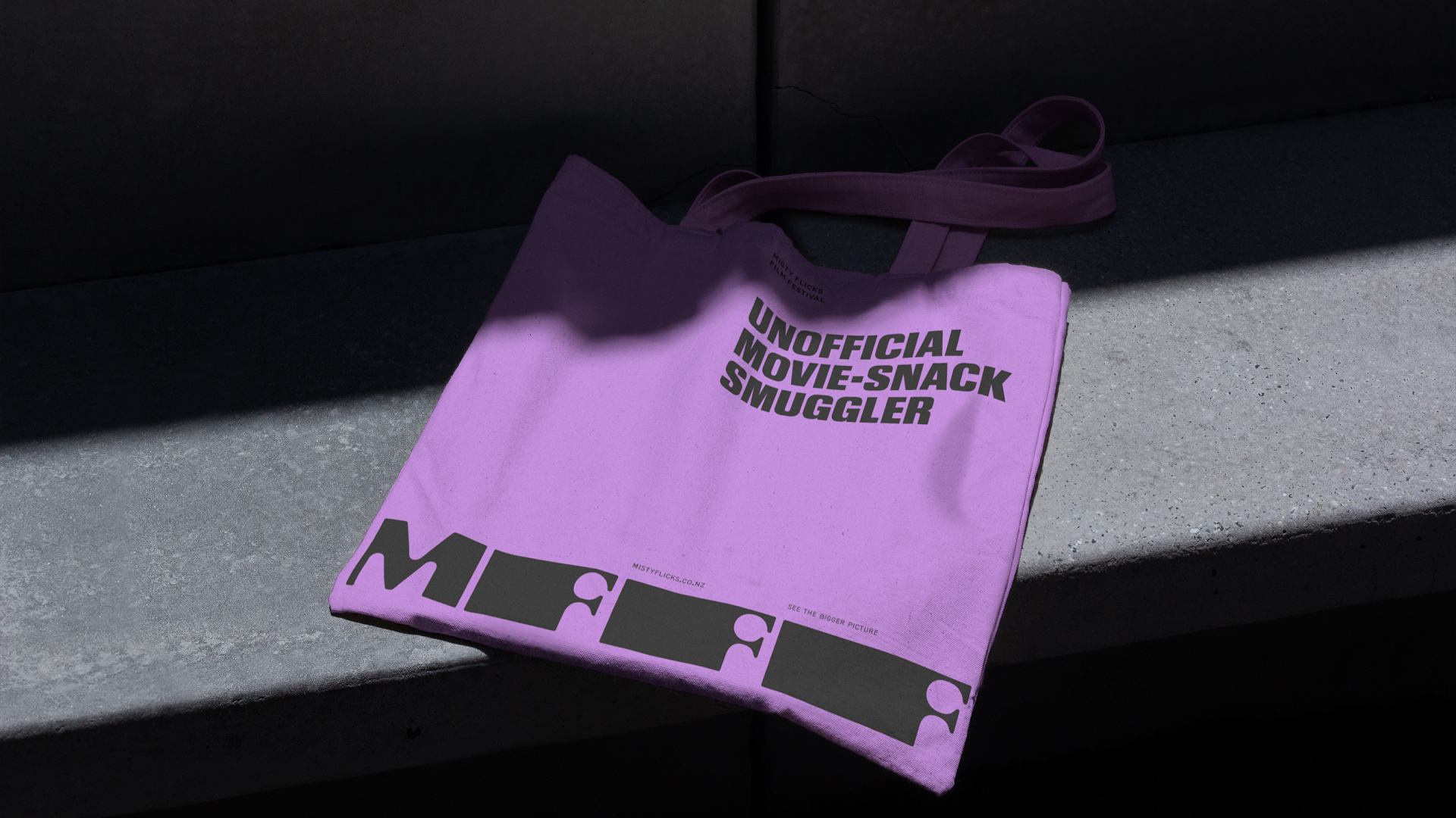
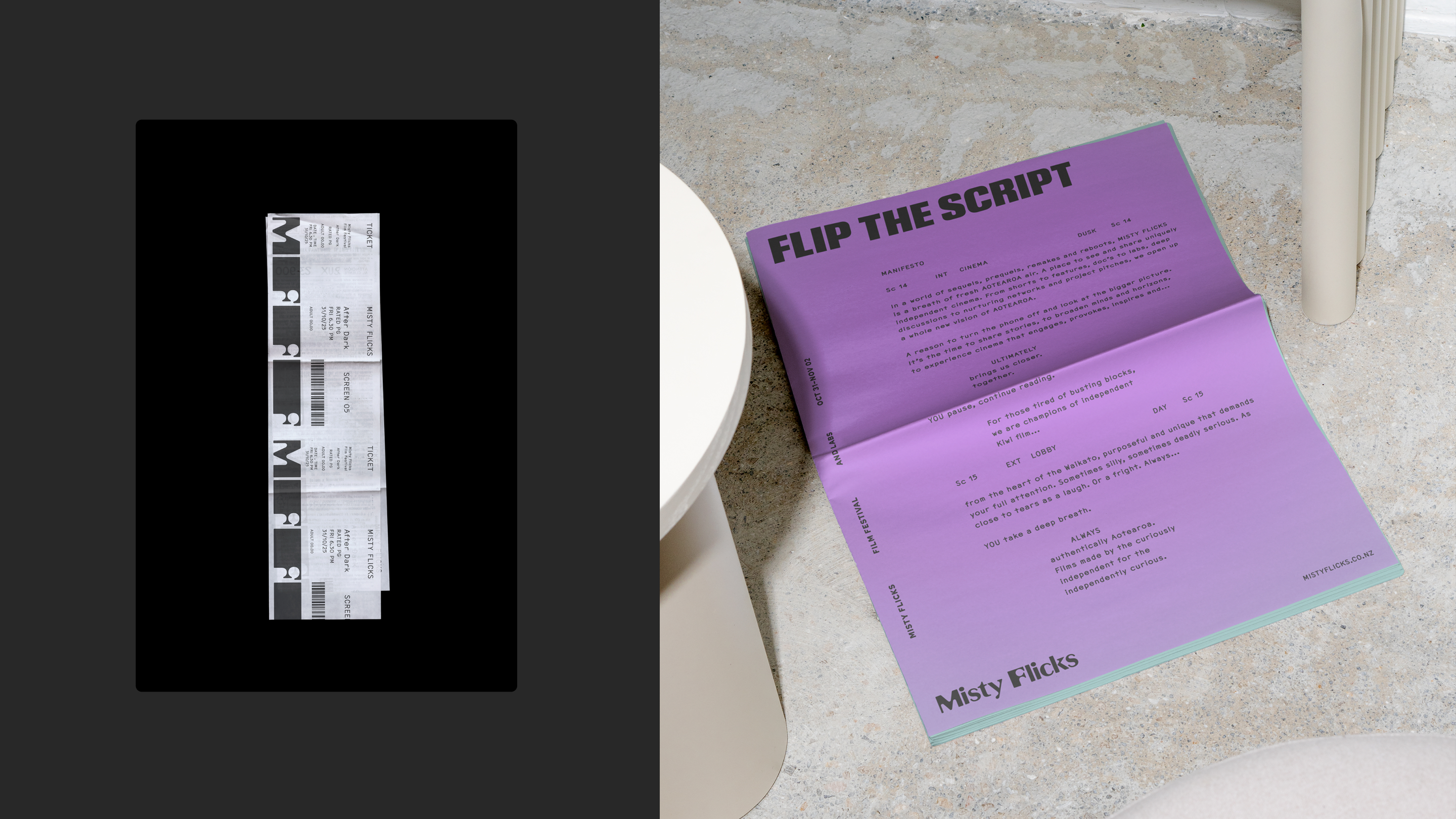
The final identity is built around a dynamic monogram system inspired by classic film aspect ratios — extending, compressing and stacking to reflect different formats and the idea of expanding perspective. This device became the spine of the visual language, adaptable across everything from posters to merch to digital screens. A bold typographic pairing of Review Condensed and Coda/Red Hat delivers impact with a distinctly editorial edge, while an expressive colour palette — from Star Purple to Lights Out Black — brings drama and personality. Radial gradients echo the glow of projection and create depth across print and digital environments. Imagery was treated with cinematic blur and grain to unify real-world photography with the brand’s atmospheric tone, while layout grids were structured around divisible film-friendly ratios (e.g. 12×6/6×6) for consistent, scalable design across campaign assets.

The Outcome
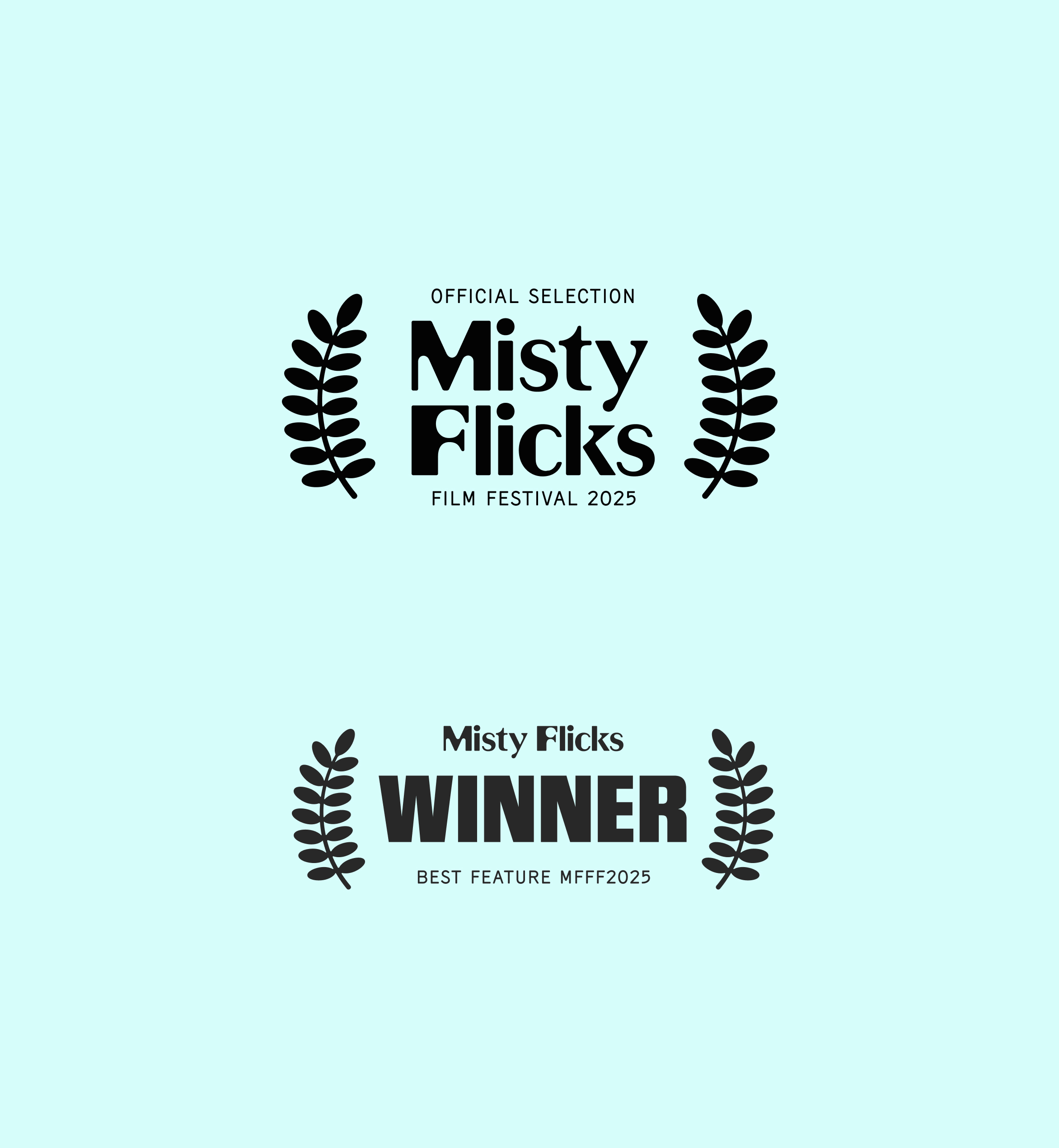
The result is a confident, culturally rooted identity that elevates Misty Flicks from a local festival into a national platform for independent film. The system gives their team flexibility and clarity — a toolkit that scales effortlessly across titles, seasons and formats — while reinforcing the festival’s role as the home of curiously independent filmmakers and independently curious audiences. With a renewed sense of purpose and a distinctive visual presence, Misty Flicks now steps into its next chapter with a brand that matches its ambition, amplifies its voice, and invites more people to look up, switch off, and see the bigger picture.
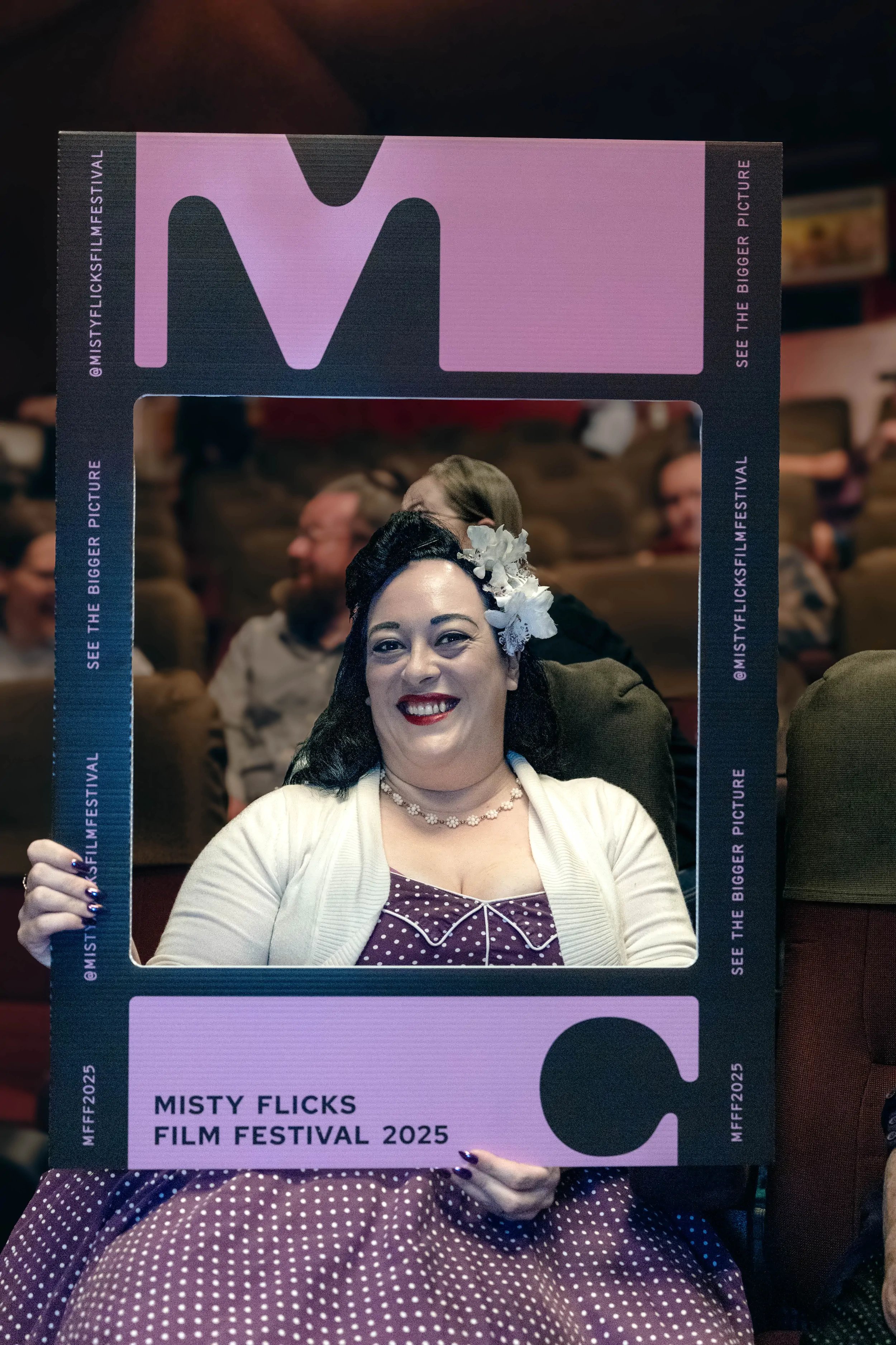
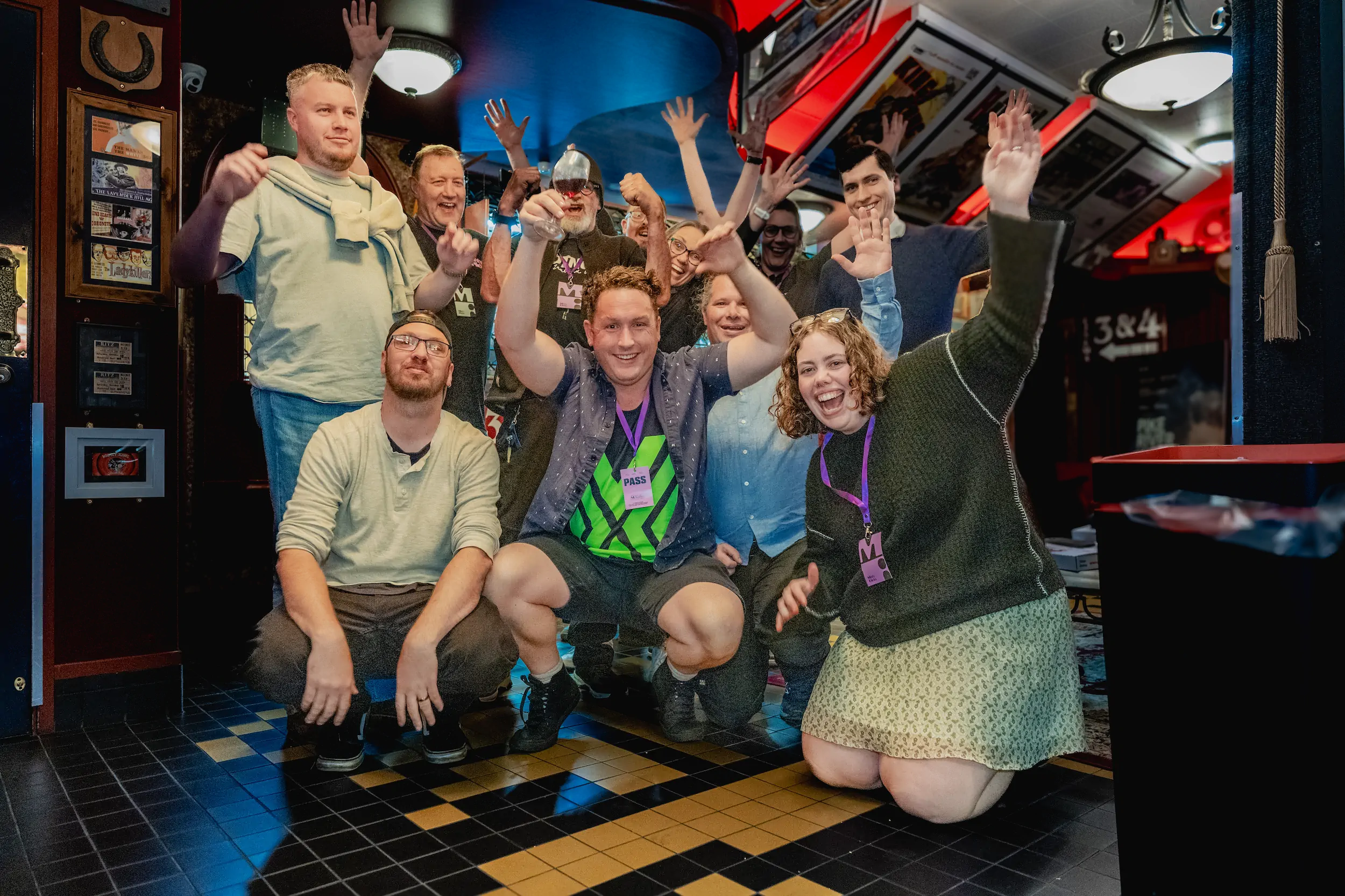
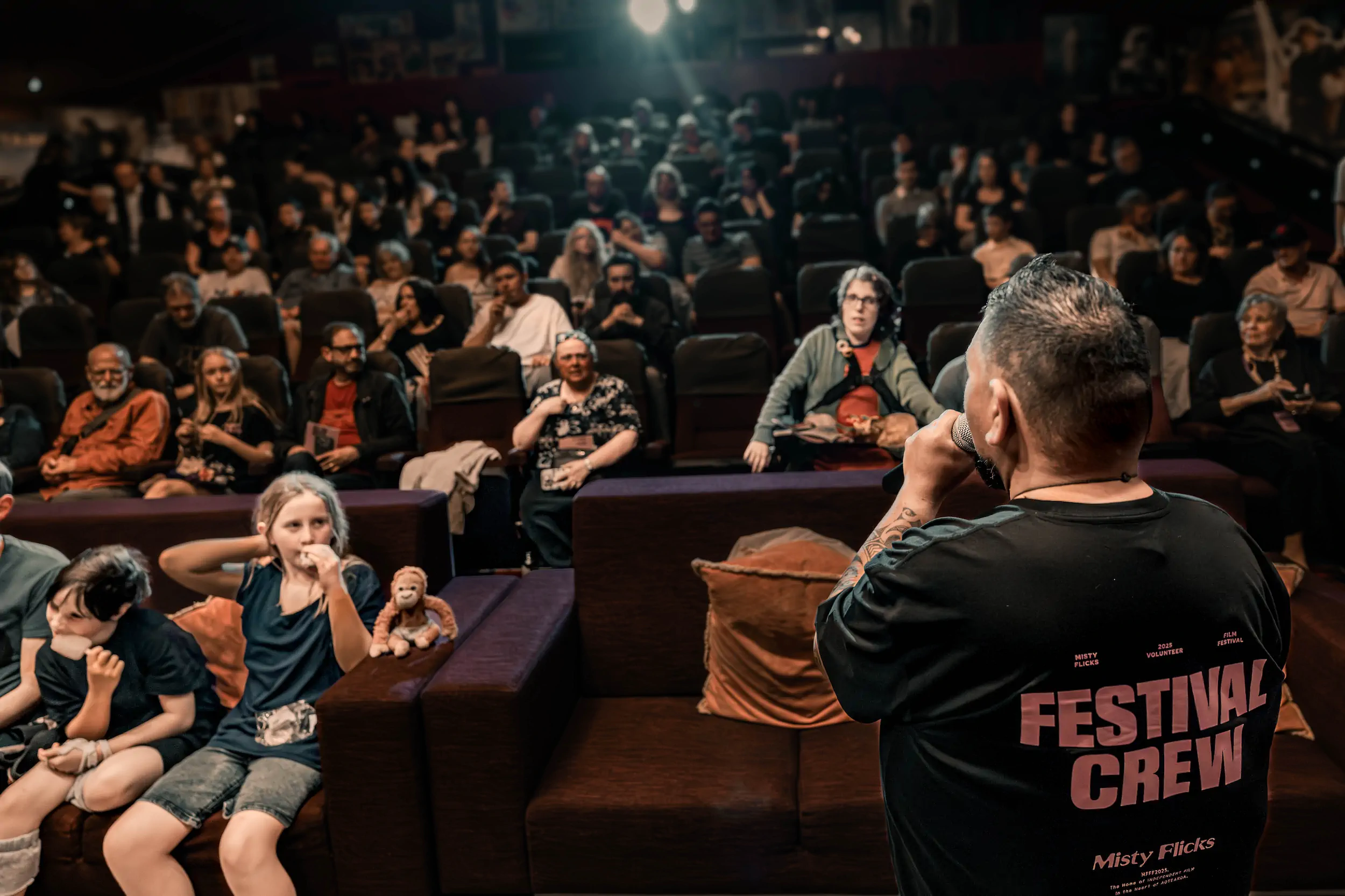

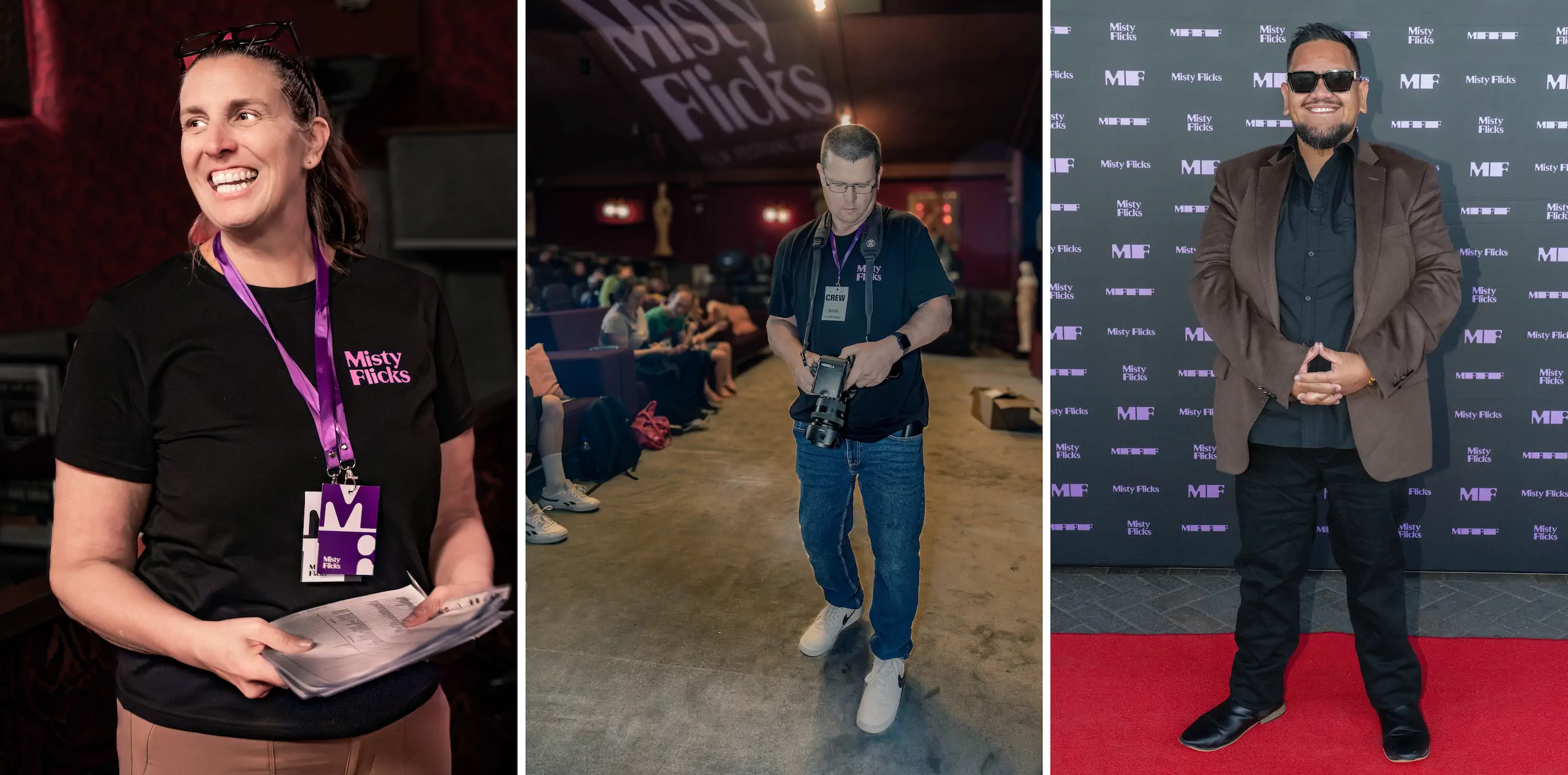
"Thank you for supporting us. As I’ve shared before, our new look and feel has made a massive difference. I’ve seen the way it’s impacted the team and how they’ve all stepped up. The filmmakers are loving the mana that comes from our brand. And more so than ever before, people are actively engaging with and sharing our content online (speaking of which, our Facebook and Instagram reach has just surpassed 75,000 views in the last 30 days, and our followers have increased significantly too). We received so many compliments and positive feedback on the branding. And it was great to hear people wanting to keep copies of the program and even their lanyard cards as souvenirs. (That’s a first for us!). Adding to the excitement, our photographers are starting to send through photos from the weekend, and the ones in front of the brag wall are great! Our new look and feel was a significant step up for us, and people noticed. I know I’m saying it a lot but thank you."
Tracey Hancock, Chair of the Board of Trustees

