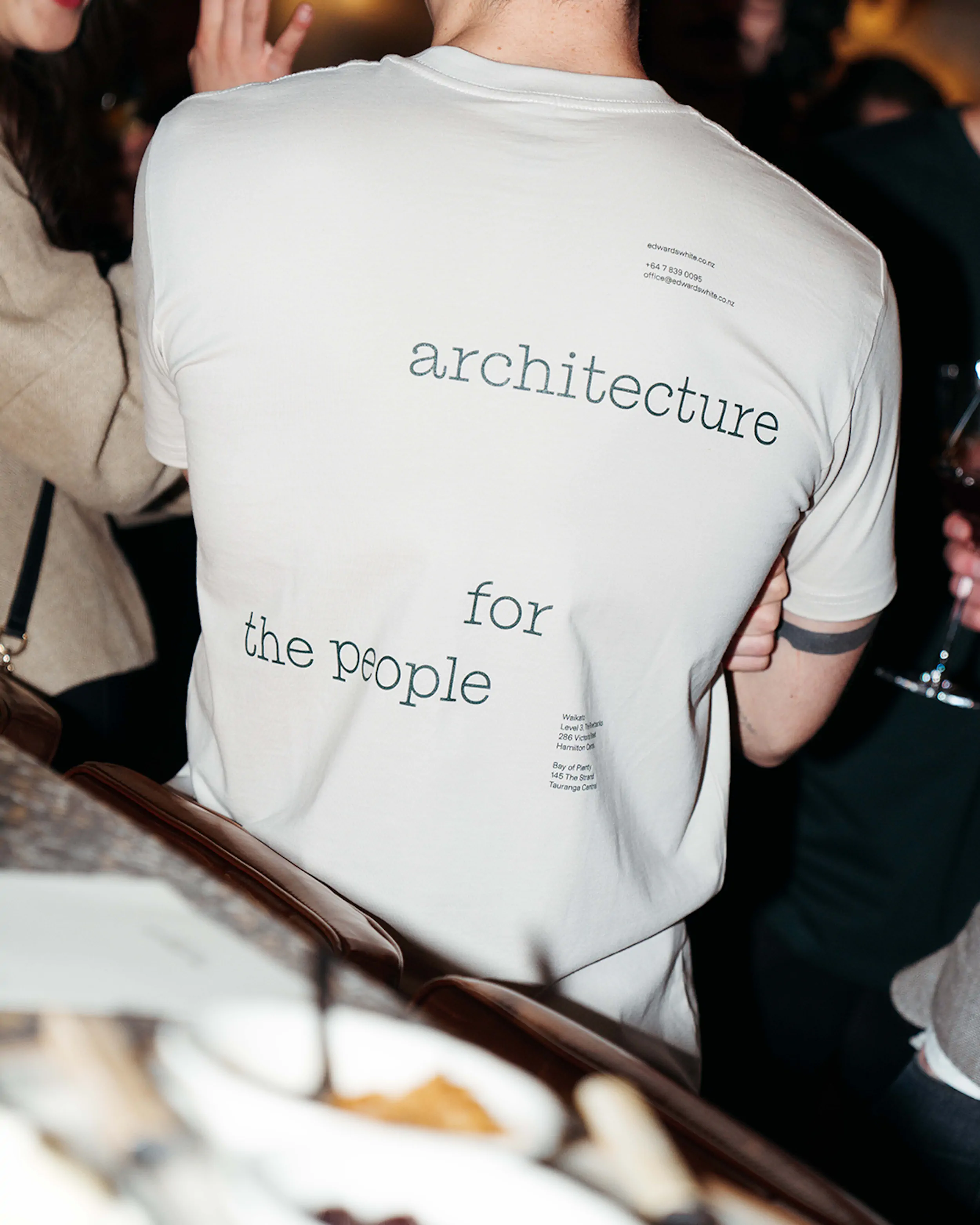
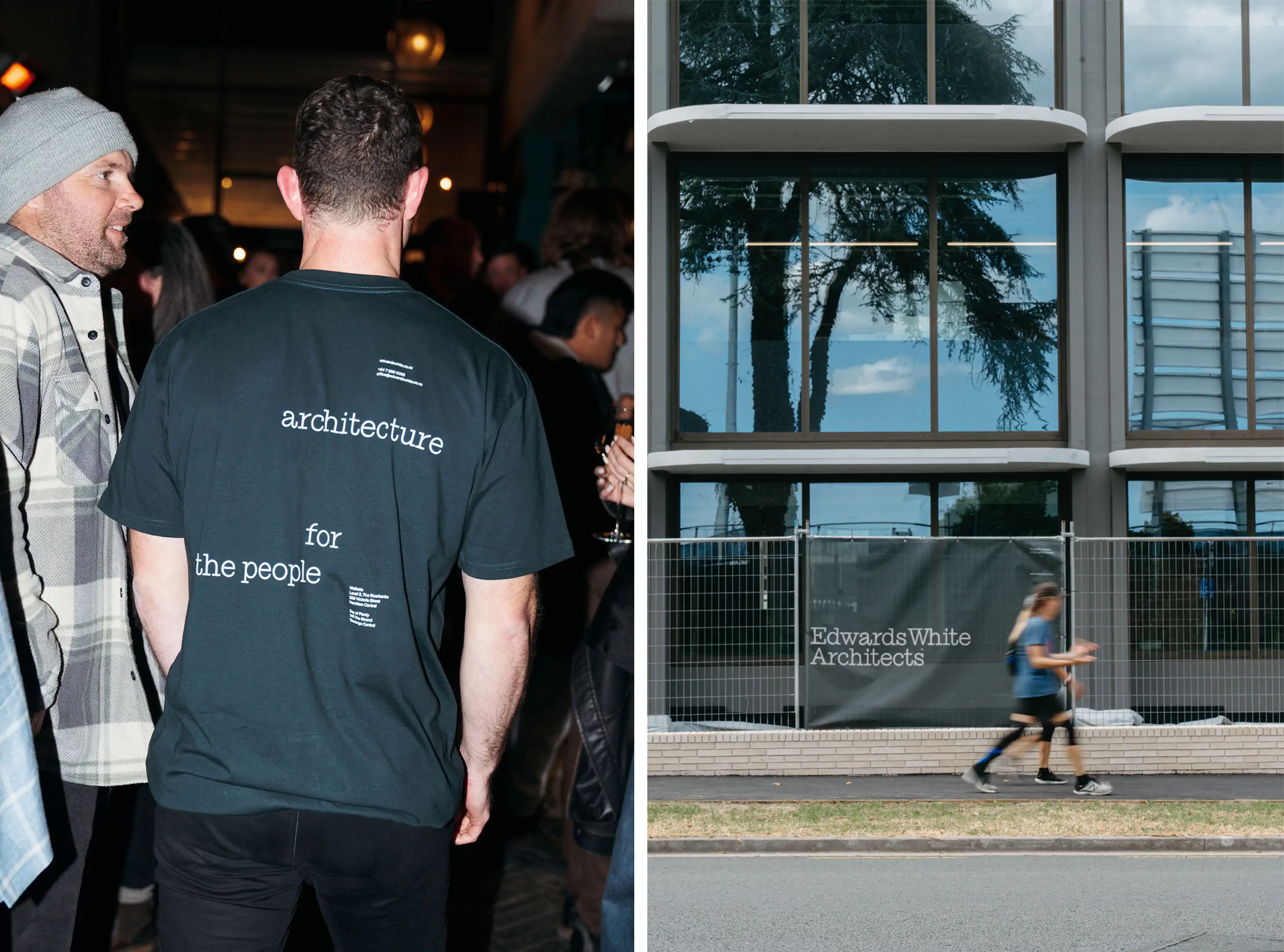
Architecture for the people
Client
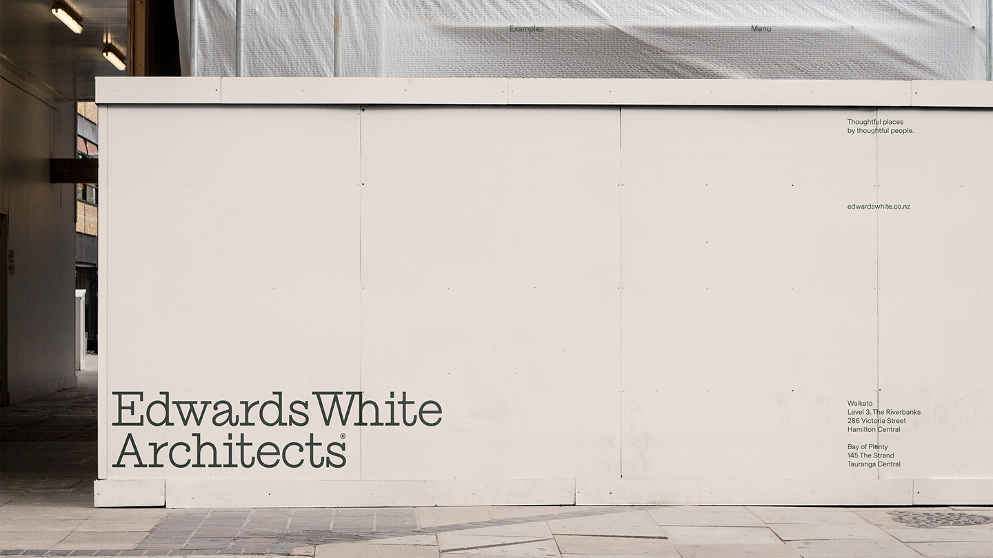
Edwards White
scope
All Projects
Identity
Digital
Strategy
UI Design
Webflow Development
sector
Professional Services
The background
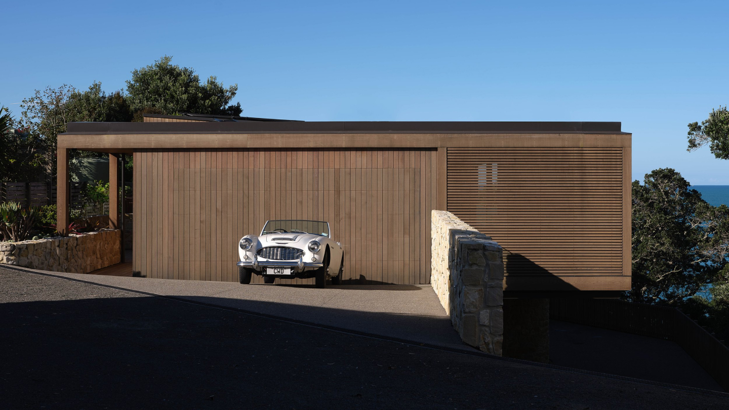
Edwards White Architects asked us to create a brand identity that better reflects how they think and work. The core idea anchoring the work was “People places”. This reflects their belief that architecture is about more than finished buildings - it’s about how design enriches everyday life. Their approach is thoughtful and collaborative, but this wasn’t clearly communicated through their existing identity or website. Our role was to bring this idea to life through a cohesive identity and a digital platform that communicates both their work and the thinking behind it. We established a clear brand foundation, created flexible design elements that remain consistent while adapting to their needs, and focused on the website as their primary point of engagement.
The Strategy
We began by establishing a clear brand platform grounded in people, place and process. This thinking informed both the visual identity and the digital approach, ensuring the two were developed together rather than treated as separate outputs. The identity needed to feel architectural and disciplined, but also warm and human, while the website needed to act as a frame for the work rather than a distraction from it. Digitally, the strategy focused on clarity and relevance. We structured the site around Edwards White’s key client groups — Residential, Commercial, Public and Interiors — acknowledging that each audience engages with architecture differently. The website also needed to provide greater insight into the studio’s approach, opening up space for process, sketches, conversation and behind-the-scenes content, rather than presenting projects as finished artefacts alone.
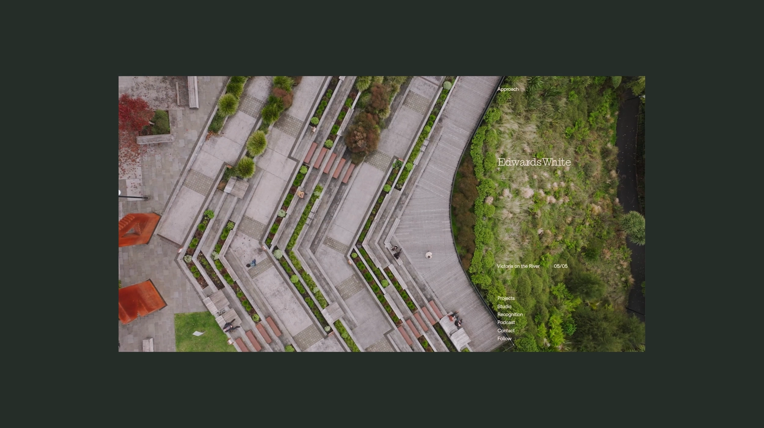
The Solution
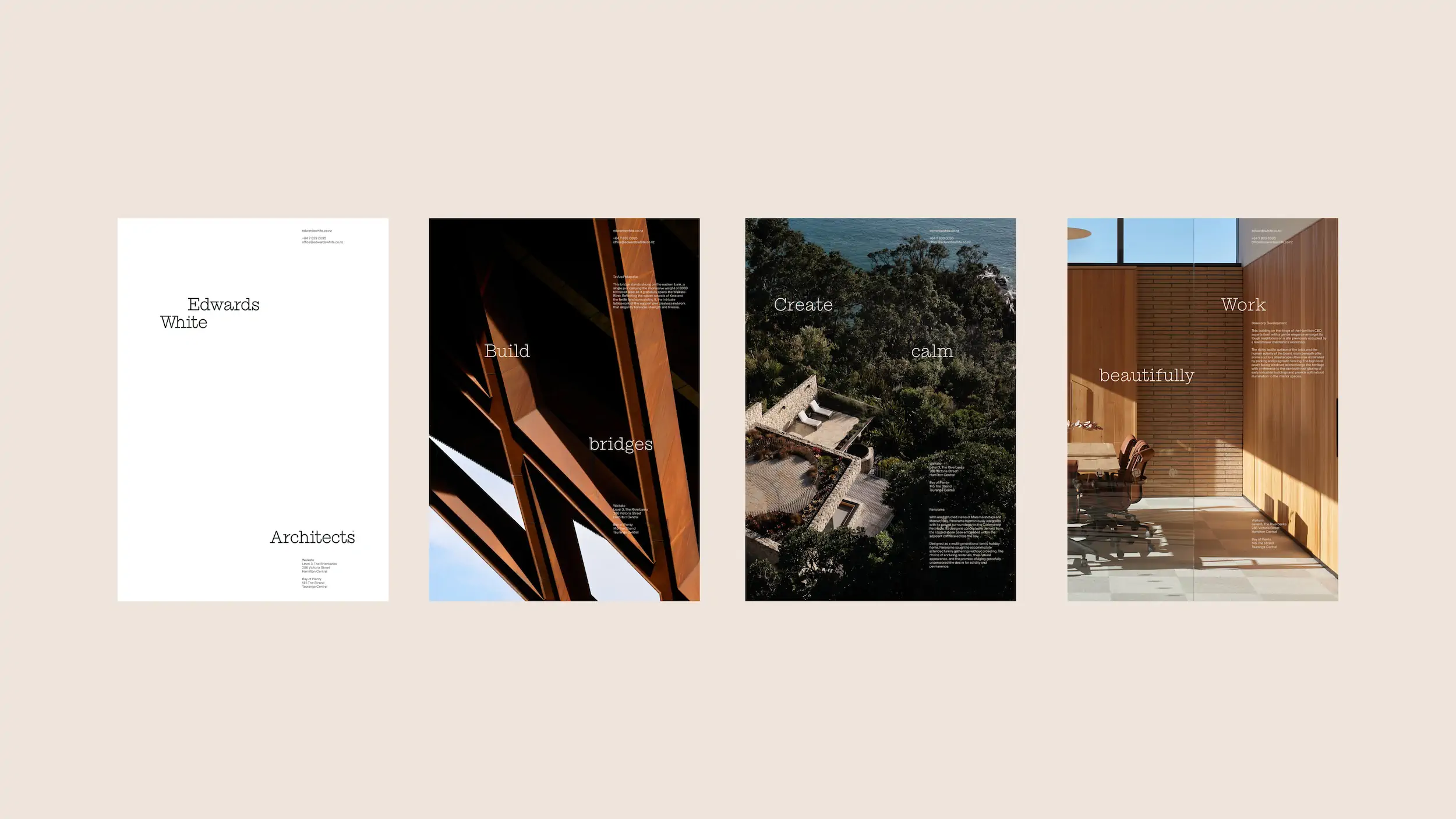
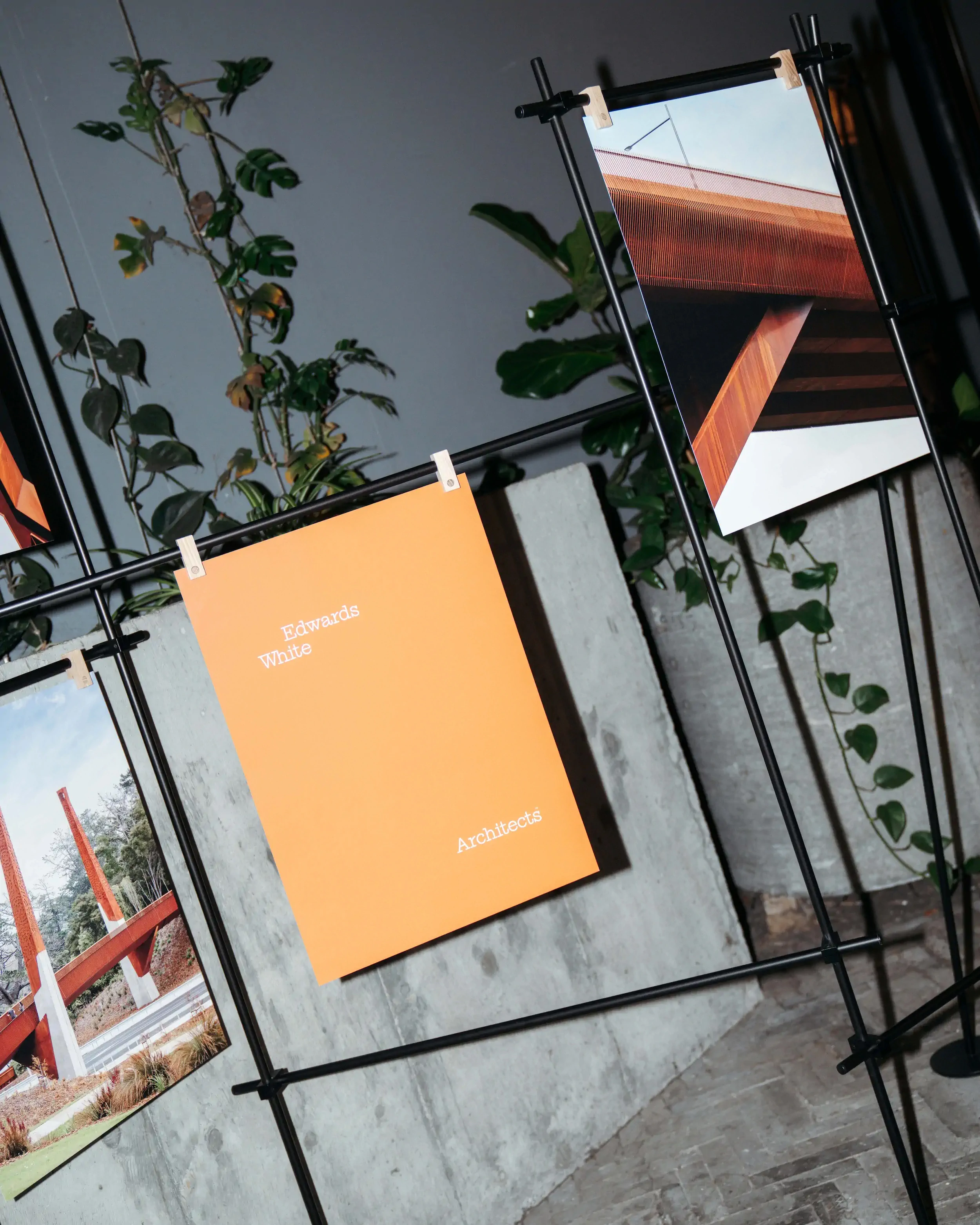
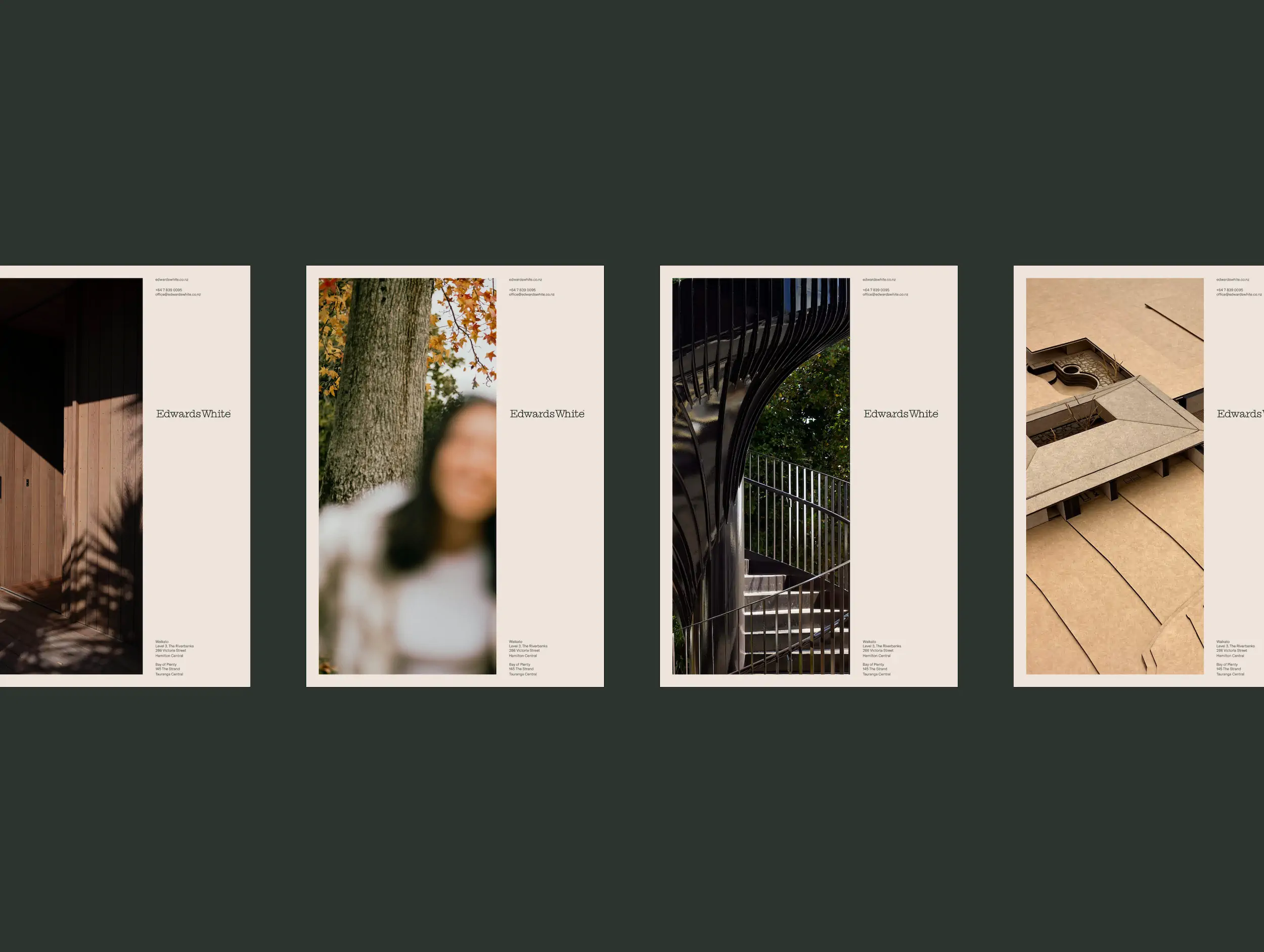
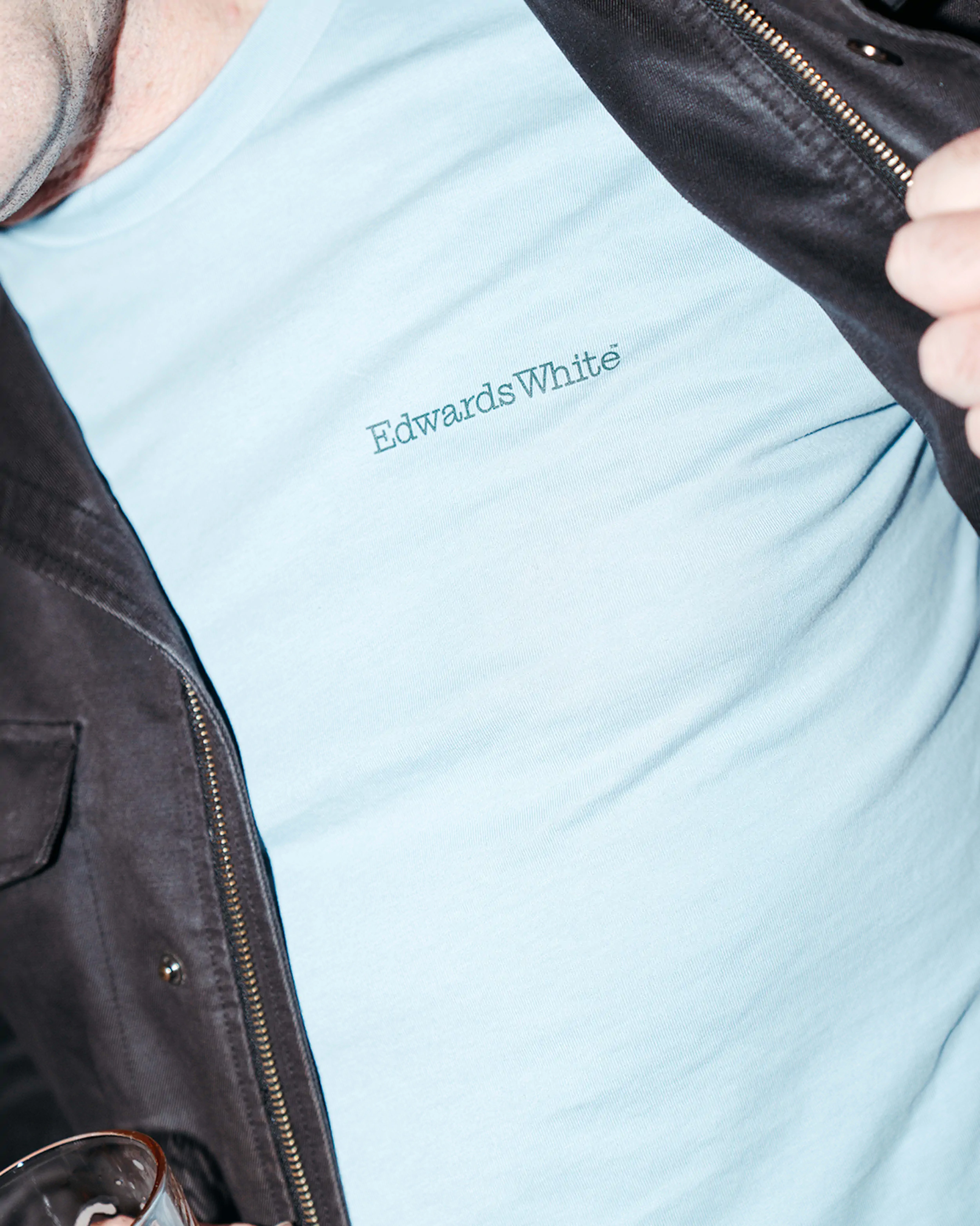
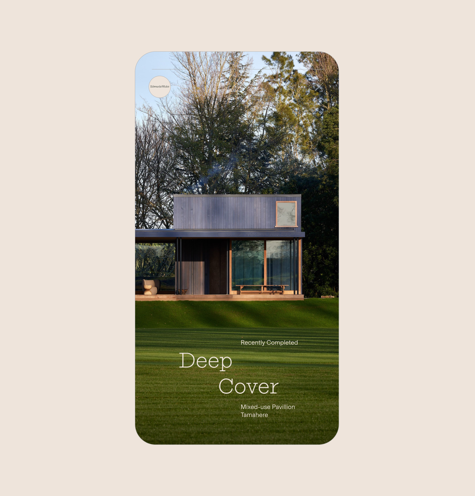
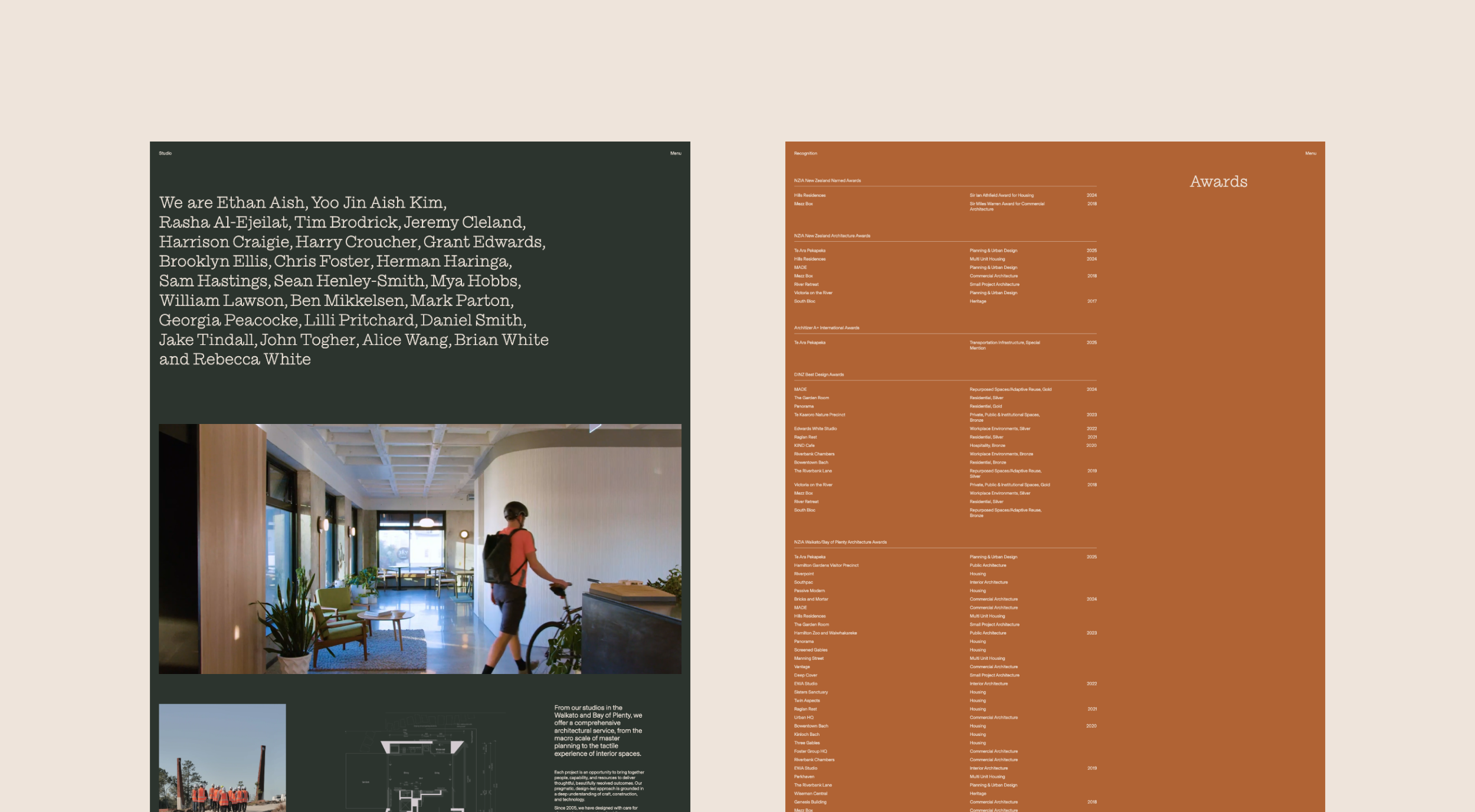
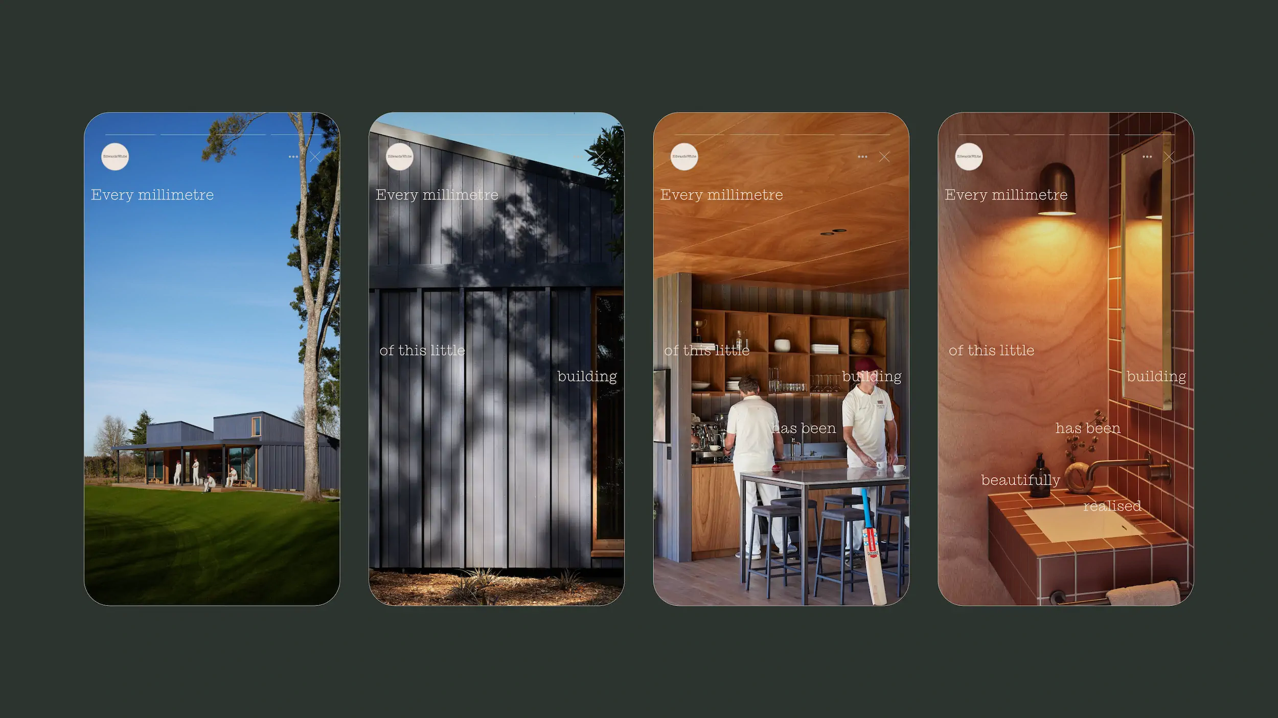
The identity is built around a refined wordmark in Ionic No. 5 Light, with Basel Grotesk for long-form clarity and legibility. Typography balances precision with subtle character, reflecting the studio’s architectural approach. A muted colour palette draws from materials and landscapes in their work, adding warmth beyond the typical black-and-white architectural norm. The website applies these elements in a clear, structured layout that puts projects front and centre, with disciplined grids, generous spacing, and strong hierarchy guiding the eye. Client group pages start with a short philosophy statement that scrolls down to a concise three to four word expression, keeping focus clear. A flexible, filterable CMS allows all projects to live within a single system. Projects can be short or detailed, and including photography, video, sketches, floorplans, citations and commentary won’t damage the overall structure. Video plays a stronger role across the site, adding movement and depth, and the platform is able to easily accommodate the studio’s ongoing podcast conversations. The studio page highlights the people behind the work, showing that their designs are shaped by the individuals who create them.
The Outcome
The result is a cohesive identity and digital platform that reflects the quintessence of Edwards White Architects. The identity provides a clear, consistent foundation, while the website brings it to life in a purposeful, measured way. Together, they showcase the studio’s work, process, and people with clarity and confidence, allowing clients and audiences to engage seamlessly with their brand. The platform is designed to support the practice now and into the future.

Credits
Ionic No 5 Light by MonoType
Basel Grotesk by Optimo
Aktiv Grotesk Condensed by Dalton Maag

©MMXXII Daymark Studio Ltd, all rights reserved. Privacy Policy.
