Where learning knows no bounds.
Client
St. Peter's
scope
Identity
Digital
Illustration
Strategy
All Projects
sector
Education
The background
St. Peter’s, Cambridge is charting a new course as it heads to its centenary year in 2036. Our brand team was privileged to support the school on this journey by designing a refreshed brand identity that will act as a strong foundation for realising the school’s vision and aspirations. St. Peter's School faced a disconnect between their actual identity and their brand representation. Through historical research and engagement with the school, we helped to uncover, and develop a new brand strategy, creating a clear foundation and roadmap for how their brand should be experienced online and offline.


The Strategy
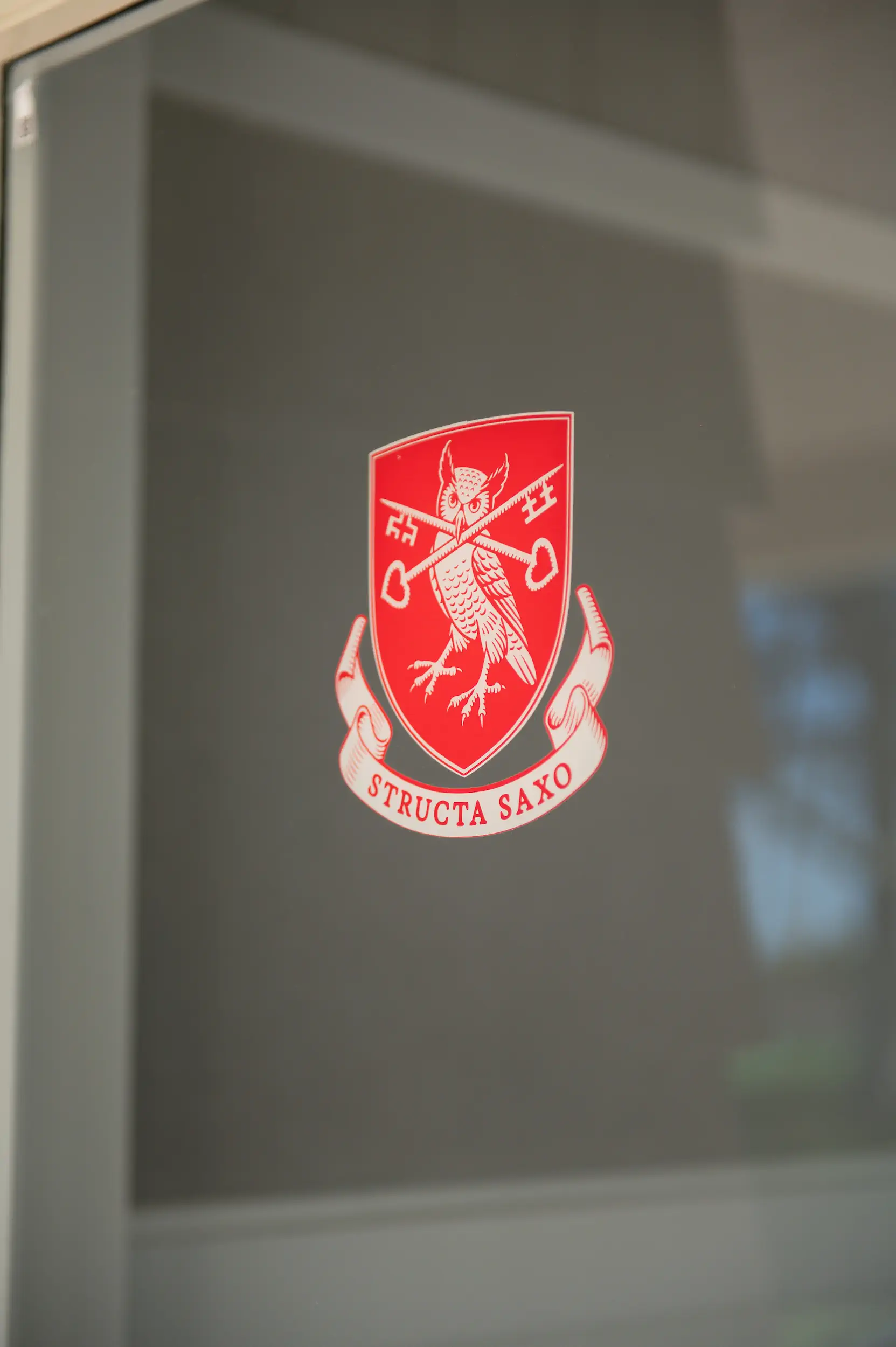
Our strategy was rooted in returning to the school's origins and revisiting the vision of the founder, Arthur Broadhurst. We leveraged the school’s founding motto, "Structa Saxo," meaning "built on a rock," which is derived from the Parable of the Wise and the Foolish Builders. This parable, which emphasises the importance of building on a strong foundation, resonated deeply with the school's mission of providing a robust and enduring education. By anchoring the brand in this historical depth and modern relevance, we ensured that the school’s identity was firmly established and consistently communicated. The brand also needed to manifest spatially, influencing the renovation of existing buildings. These physical manifestations of the brand not only reflect the school's historical and architectural significance but also create an environment that fosters pride and elevated learning opportunities. This approach ensured that the brand was experienced holistically, from uniforms and signage through to digital and the physical spaces where students learn and grow.


The Design
The design merged historical elements with modern aesthetics. Anchored by a vision rich in historical references, we redefined these elements within a contemporary context. Key features included a commissioned owl crest by illustrator Trevor Powell, enhancing the school's emblem of wisdom with etched styling. The custom typographic wordmark, inspired by modified slab serif fonts, conveys strength and heritage.. The colour palette, Sax blue, scarlet red, stone white and midnight blue, draws from both the school's historical documents and the founder's English roots, particularly reflecting the era's print technology and the Hinuera stone used in the original buildings. Design elements like softened ink bleeds connect with the school’s 1936 chronicle, while the modernised Prophet hero typeface brings a contemporary edge to the historical calligraphic style.


The Outcome
The brand refresh has revitalised St. Peter's School’s identity and gave the team a strong, agile toolkit to help them communicate consistently with clarity and impact. By celebrating the school’s heritage the new branding is also fostering a renewed sense of pride and community cohesion helping the school more clearly articulate their purpose, values and point of difference in current and future students.


Credits
Illustrator: Trevor Powell

