
Make your way home
Client
Olympus
scope
All Projects
Digital
Identity
Illustration
Naming
Strategy
sector
Property
The background
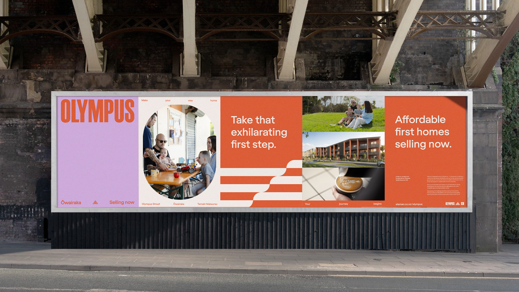
Elaman’s Olympus Street development in Ōwairaka is more than just a collection of homes—it’s a vision for modern, connected living in one of Auckland’s most desirable neighbourhoods. Tasked with creating a brand that would set this development apart in a competitive market, we focused on crafting an identity that reflects Elaman’s commitment to building aspirational, people-first spaces.


The Strategy
The strategy for Olympus focuses on helping first-home buyers take their "exhilarating first step" toward homeownership. We targeted individuals and couples eager to escape renting and establish a secure future. These buyers value affordability, quality, and a sense of community. We positioned Olympus as more than just housing—it's a foundation for their future. The brand promise emphasises lifting Kiwis up, combining affordability with well-being in a development that fosters growth and security. Ōwairaka’s vibrant, green space and proximity to the CBD offer the perfect setting for this community. The brand tone needed to be authentic, uplifting and inclusive, capturing the excitement of homeownership while ensuring high construction quality and energy efficiency. While the look and feel needed to be energetic, inviting and strong.


The solution
Our brand identity draws inspiration from the 1964 Olympics, a significant year for Ōwairaka athletes, with Peter Snell’s record-breaking victories and Murray Halberg’s retirement. The wordmark reflects the bold typography of the ‘64 Games, while the brand icon takes cues from Mt. Olympus, incorporating four striped segments that symbolise both the four blocks of Olympus and the steps of a journey. Softened corners add an inviting, local feel. These elements extend into dynamic brand patterns—one derived from the icon’s linear form, reinforcing movement, and another from the ‘O’ in the wordmark, echoing the curves of a running track. The colour palette pairs a bright orange-red with a pale lilac, creating a modern yet warm aesthetic. Anchoring the brand, Regola Pro, a geometric-grotesque sans serif, balances clarity with warmth, complementing the strong yet welcoming visual identity.


Credits
Photographer: Glenn Manchester
Photographer: Boshi Wang
FT Regola by Formula Type
Schmalfette Grotesk by Diorama Type Partners

©MMXXII Daymark Studio Ltd, all rights reserved. Privacy Policy.
